Client:
Stratasfear Productions / PaintProject Type(s):
- Branding + Identity
- Copywriting
- Logo Design
- Graphic Design
- Web Design
- Photography
- Film / Video
Completion Date:
September 30, 2015Intro
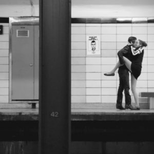
While developing the music video for Toronto rock band Paint’s single “Boomerang” in the spring of 2013, frontman Robb Johannes began talking about their next musical release. He had written a 16-page visual treatment for a series of videos that would accompany the 4-song EP Based on Truth and Lies (at the time, untitled), which he had dubbed 11:11: a “sex, drugs, rock-and-roll” analogy that would pair with the songs of loss, longing, and redemption and elevate them into a new level of art beyond the band’s soon-to-be-completed “music video for every song on an album” project Capsulated.
In speaking of the story behind the songs and how they could be best executed based on the visual treatment, we began to realize that the visuals might not fit neatly into the actual time duration of each song – we decided to see what would happen organically by simply approaching the filming of each story in sequence and working out the final presentation in post-production: a decision that ultimately turned the simple 16-minute visual project into an hour-long experimental film.
The “Look”
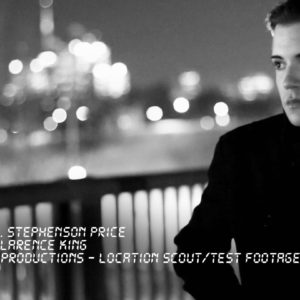
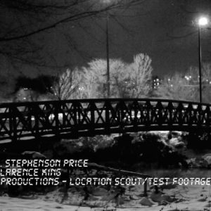
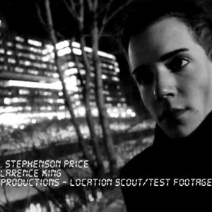
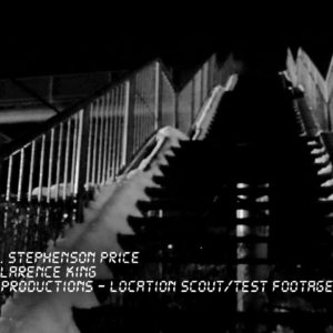
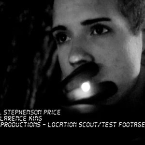
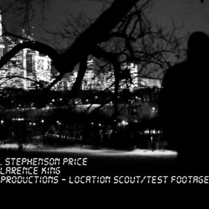
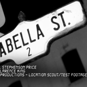
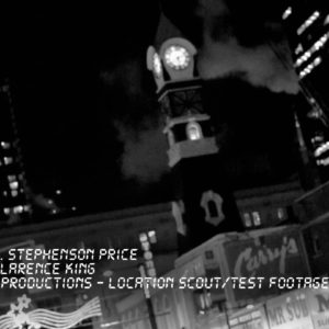
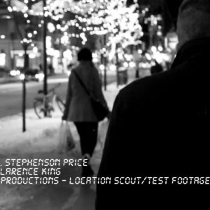
Initial visual tests and location scouting took place in November/December 2013, which gave us an initial idea of how to approach shooting in some of our interior and exterior locations.
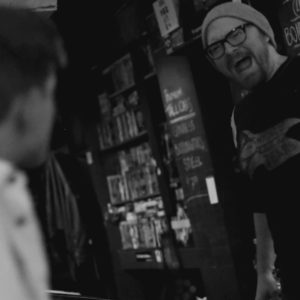
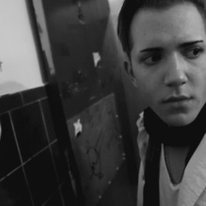
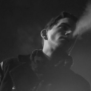
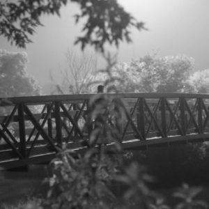
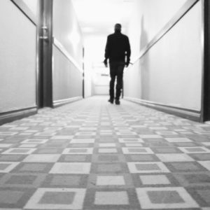
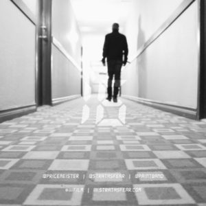
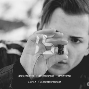
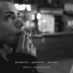
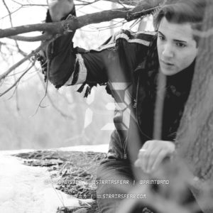
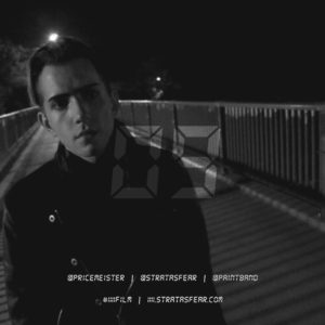
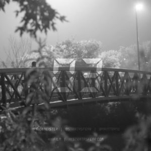
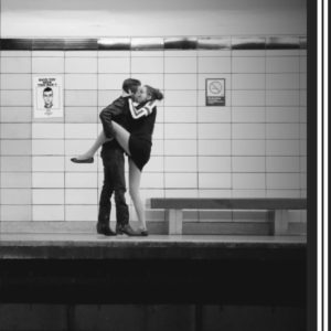
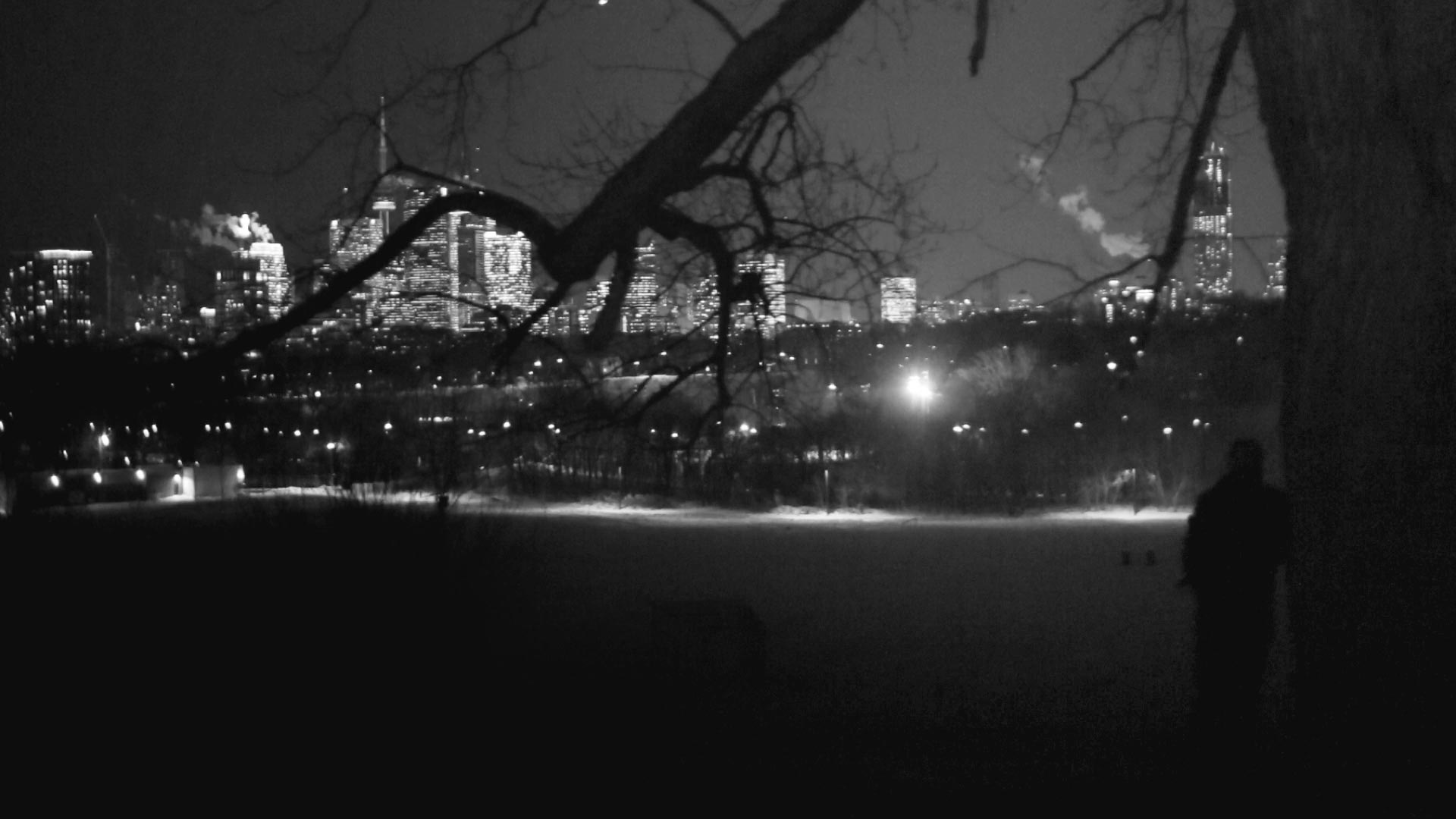
Seeking a classic cinematic film look, we opted to produce the film in black and white, rather than full-colour – in part to emphasize the seedy nature of the drug use in the film, but additionally to help cut down on post-production costs by alleviating the need for proper colour-correction. We softened this final look by pulling back the tonal curves in the completed footage – settling the low and high ends of the tonal range at a dark charcoal and egg-white respectively – before overlaying a bit of film grain in the final footage for a more cinematic look.
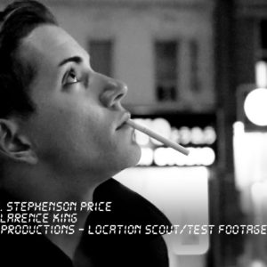
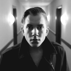
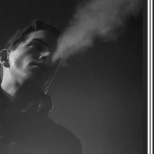
All lighting in the film was diegetic – we used no additional lighting materials other than what was available in the spaces we shot – using in-universe light fixtures, street lamps, and tea-lights, in addition to protagonist Trevor’s predilection for cigarettes (and his lighter) for additional spot lighting on his face.
With filming taking place across 2013-2015, we opted for shooting on Canon’s 6D DSLR system – their most recent release at the time – which offered a full-frame sensor with much improved performance in low lighting, improving our ability to work at night in our exterior locations.
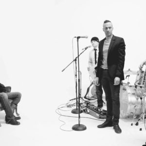
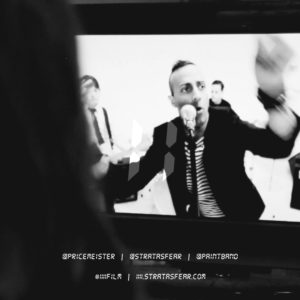
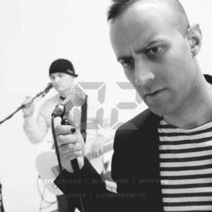
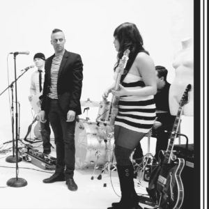
The accompanying “white room performances” for each of the four songs on the EP were inspired by the Black Lodge sequences from David Lynch’s Twin Peaks, with the performances themselves filmed as a simple multi-cam edit (a single mid-close up for each band member and a moving wide shot); however, the integration of the white room into the film itself was played more directly as an hommage to Lynch’s television opus, replicating the editing sequence from the Twin Peaks pilot episode in the framing of each shot in the final edit in 11:11.
The Brand/Identity
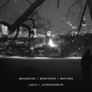
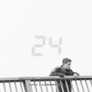
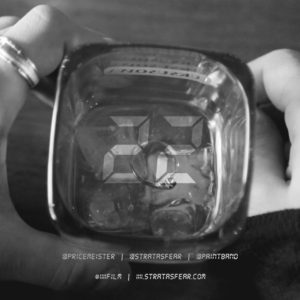
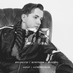
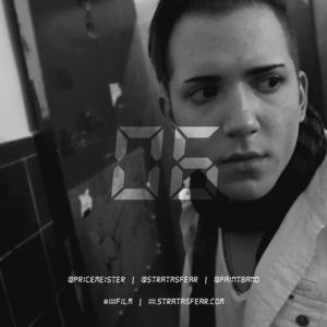
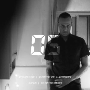
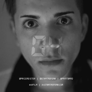
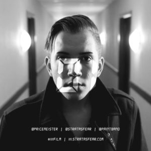
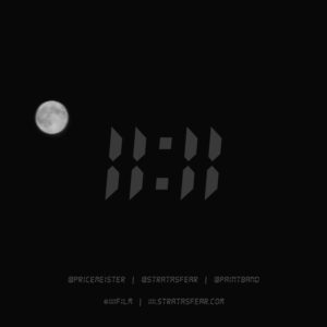
The band decided to deviate from their own “London Underground” styled branding with 11:11 – feeling that it deserved to stand alone with its own proper identity. Using a modified version of a “digital readout” font, we created a simple digital clock style 11:11 icon and continued to include the font usage across all subsequent headlines in the project’s branding and titling – in posters, physical handouts, and on the project website.
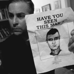
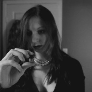
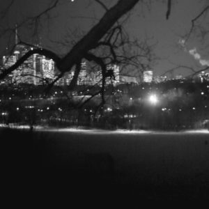
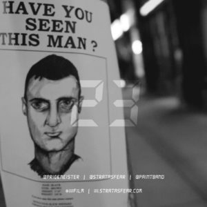
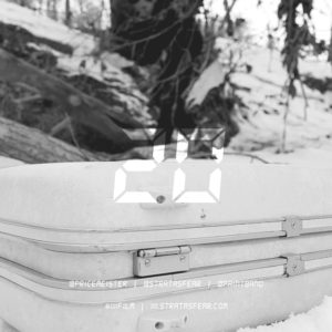
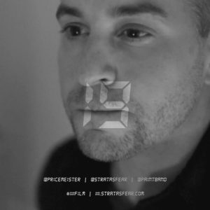
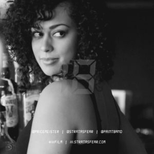
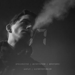
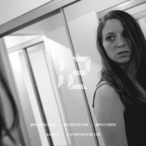
All materials would feature images pulled from the film’s production stills themselves: the poster would feature key visuals from the opening and closing of the film alongside mask-cropped character cutouts of key characters from the film. The digital assets for promoting the film would use the same production stills for social media headers and for square “countdown” graphics used leading up to the theatrical release of the film on both Instagram and Twitter.
The Website
The website itself was the first iteration of the “film project” system on stratasfear.com, featuring a full-screen intro panel, an outro “credits” panel, and subsequent full-width content blades (what we began to call “infoPanes”) in between for each major project information section: Project Trailer, Project Overview (About), Character Bios, Behind-The-Scenes Photos, The Making-Of Documentary Series, Press Materials (including Production Stills), and a Special Thanks.