
This was a secret project being kept under wraps at t.o.night Newspaper for probably close to two months now, and only a select few of us on staff had any inkling of what was going on. It was kind of funny how I had to hide my screen whenever I was working on it so no one else in the office knew about it prematurely – kind of spy-like.
I’ve been keeping tabs on the twitter feeds, so I’ve seen this kicking around amongst the business, marketing and journalism blogs – most of which were content to regurgitate press releases earlier this week when this first launched… but since I’m not a press release machine, let’s get down to the nitty-gritty: conception and design!
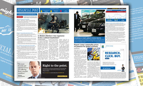
We’d been running our classy brown-styled business section since the publication redesign in February 2010 to knock out the 1.5″ headers on the pages.

Classy… yes… to the level of prestigious…. well… probably not.
With this latest content partnership – following BlogTO, The Score, and OpenFile – I was looking to really capture the essence of Financial Post’s stylization while maintaining consistency with our template system’s already established page element format.
This ultimately came down to two different sides – first I tried to match FP’s font style and header-dek-body-credit-caption breakdown as best I could with the fonts we already had at hand. The blue colour for the section was also lifted directly off the blue of the .EPS logo file that FP’s creative department supplied us to work with for our creative executions.
This first batch of mockups was inspired by Financial Post’s vertical identity strip with prominent logo adorning the page, though when the FP team came back with revisions they were actually more interested in seeing what the page would look like leaning more towards our sectional top-banner style.

The market number/data concept was something our publisher John Cameron was eager to reproduce as well from their print and web editions, though we needed to find a nightly spin on it so the numbers wouldn’t seem untimely from market-opening numbers (and since the markets are still in full swing when we hit our print deadline at 11AM) – this ultimately fell to quarterly gain and losses numbers by default, though other options exist for future insertions – these were also styled similar to the data arrows in the print version of Financial Post.
Because of FP’s keen interest in promoting the ongoing news on their website, I also tried to emulate a few of their web elements through the use of the red “tomorrow” arrow that could highlight upcoming online stories, and the section breadcrumb arrows jutting onto story photos.

I also did a mockup with the FP logo in black on a white popup box (like our recurring Tuesday OpenFile section), though we ultimately didn’t feel it had enough visual punch. (SEE ABOVE IMAGE)
From the t.o.night design side, we maintained a fair number of elements: after dropping the vertical strip design scheme, the date bar in the upper right remained the same, and it led to my instituting white space separations between some of the page elements to create better sight-lines; the 0.25pt advertising dividers were left intact.
The story brief format also stayed the same with the section-coloured headline, grey locale and credits, and the stock summary box/graph simply changed over to the FP colour scheme.

John and Tom decided they wanted to go “all out” with the ad campaign on this one so I put together a 45-degree decal to slap on all the distribution boxes, as well as a redesigned billboard for our popular underground PATH distribution network.


We’ve been running it for a week now, and the feedback has been fantastic! I wonder what crazy content partnership I’ll get to design next…. :\