Client:
Stratasfear Productions / AzariAzariA FilmsProject Type(s):
- Branding + Identity
- Copywriting
- Logo Design
- Graphic Design
- Web Design
- Photography
- Film / Video
Completion Date:
October 31, 2016Intro
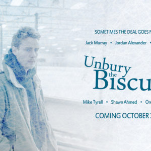
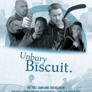
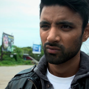
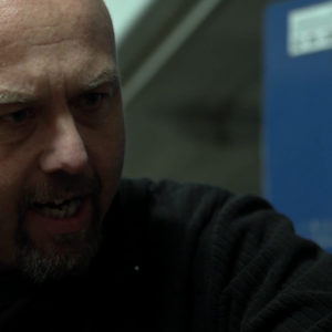
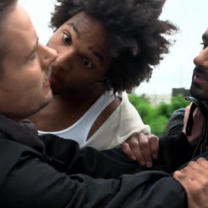
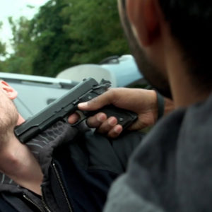
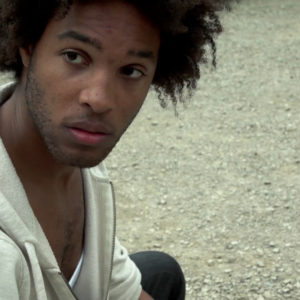
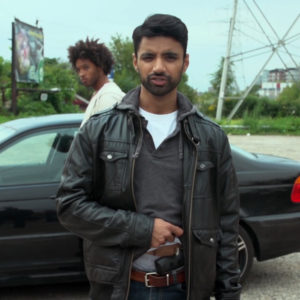
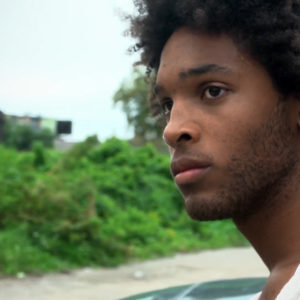
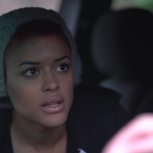
December 31st 2012, actor/writer/producer Jack Murray wanted to get together and chat about a new film project he was working on: he was looking to make something gritty for his acting reel which might be able to stand on its own as a fun and interesting narrative piece. He’d already written a basic treatment for a story he called Unbury The Biscuit – a short crime drama about a hockey player who never achieves his dream of playing in the NHL and is instead strong-armed into running drugs for a crime ring based out of a hockey arena: a story he’d heard corroborated from a few anonymous sources that he assured was indeed something that had happened in Toronto.
We soon set out to capture the look and feel of the series as he brought Stratasfear on board to produce the project, with R. Stephenson Price directing and ultimately scoring the 5-part digital series – our tagline: “Sometimes the deal goes North” a playful Canadian twist on the traditional crime drama genre trope of the “deal going south” as a euphemism for an exchange of goods falling apart or not going to plan.
The “Look”
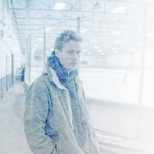
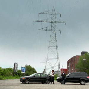
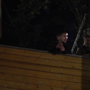
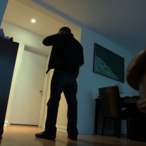
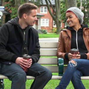
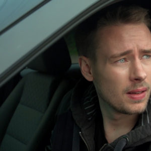
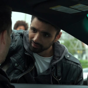
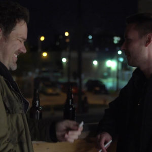
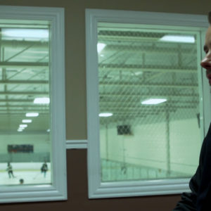
Jack had already worked out a deal with the managers of the Bill Bolton Arena in the downtown Toronto Annex neighbourhood – which solved a large part of our story setting with all the interior and exterior locations that would entail. Jack’s own apartment at the time (and its rooftop patio) would stand in for the home of protagonist Nick, while the train track-adjacent parking lot near Bathurst and Dupont (beneath the West-East downtown Toronto Hydro tower corridor) would stand in for our seedy drug deal location.
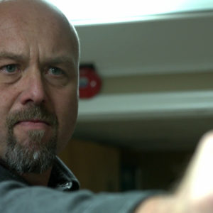
Shooting in September 2013, 4K resolution cameras at a prosumer price-point were not yet a readily-available commodity; however, 2K cameras – such as Sony’s FS100 (which we ultimately used in production) were. Adding in an E-to-EF Metabones adapter allowed us to shoot on higher-end Canon-EF Cine lenses for a greater depth of field and colour balance between lenses, alongside the 2K resolution which put us above the 1080p standard of the time with the indie filmmaking favourite – the Canon 5D-MarkII.
Much of the lighting in the series was diegetic – with daytime exteriors lit naturally with some slight reflector fills to soften shadows on the actors, and nighttime exteriors using a pair of 250W ARRI lamps to work in tandem with the basic lighting on-location. Apartment interiors used windows and pre-existing fixtures for a natural look, with the arena’s heavy fluorescent lighting selectively adjusted/reduced for a moodier feel.
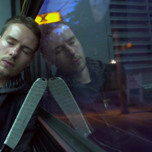
Final picture colouring was courtesy of colourist Dale Codling – adjusting exterior exposures in the raw footage, saturating all colours across the series, and coating the icy scenes with a slightly cooler temperature to accentuate the hockey motifs of the film.
The “Sound”
Unbury The Biscuit was the first official film score by Stratasfear, and was derived from a single unreleased track from R. Stephenson Price’s prog-rock music project Tridia. Naming the track “Unburied”, each segment of the 7-minute song was broken apart from the others and turned into its own respective song on the soundtrack for Unbury The Biscuit – e.g.: the intro/verse/pre-chorus became the core “Theme”, Bridge part 1 became “The Proposition”, Chorus 2 part 2 became “The Decision”, one segment from Bridge part 2 became “The Deal”, etc.
Rather than using the typical 5-piece rock band instrumentation in which the songs had originally been conceived (guitars, bass, drums, keyboard), the “Unburied Suite” was recorded using a Micro-KORG for various organic synth tones, and a Yamaha Portasound – which uses the same sound card as the classic SEGA Genesis video game console – for a more 80s-inspired electronic tone. As a result, the score of Unbury The Biscuit took on a classic video game style tonality, with each tone choice representing a different aspect of the film and its themes: a light twinkling tone representing ice/snow, a pensive drone like the hum of a crowd at a hockey game, a solid organ tone representing a classic hockey arena organ, and a grinding metallic tone representing a skate sharpening machine.
The repeating 12-note segment at the end of the original bridge of “Unburied” was ultimately turned into a recurring leitmotif representing protagonist Nick – reappearing in several songs of the soundtrack during Nick’s moments of contemplation. In contrast, antagonist Karl’s leitmotif took on a 4-note passage in the the lone metallic tone of the skate sharpening machine – crescendo-ing with each repetition as it progressed, and increasingly in each occurrence to reflect his growing menace.
The Brand/Identity
Our basic colour pallette was based on ice – landing on a graphic of a hockey rink surface adorned with skate marks in a light white/pale blue combination, and a starkly-contrasting dark aqua/turquoise tone for all overlain objects and text elements.
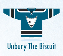
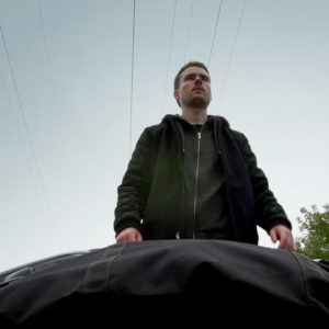
As the plot of the film revolves around the mix-up of a hockey bag filled with a drug dealer’s money and a second bag containing a dead dog, we decided to create a dog motif throughout the series’ branding – ultimately this took the form of an illustration of a dog’s head on a flat/simple-style hockey jersey graphic, which was used on the initial poster and graphics for the film during the fundraising phase of the project.
After several different iterations, we developed the wordmark for the logo in a serifed font-face called “Daunpenh” for a more regal look – stacking the words to create the shape of a dog’s head in profile view: the “the” of the title standing in for the dot on the “i” as the dog’s eye, and the dot instead moved to the end of the title like a nose (or a puck!).
“Daunpenh” was then applied across all headlines and pullquote fonts through all print and digital materials, including posters, social media graphics, dropcards, and sell sheets.
The Website
The website was the second iteration of the “film project” system on stratasfear.com, featuring a full-screen intro panel, an outro “credits” panel, and subsequent full-width “infoPane” content blades in between for each major project information section: Project Trailer, Project Overview (About), Character Bios, Behind-The-Scenes Photos, Press Materials (including Production Stills), Soundtrack, and a Special Thanks.