Client:
The Indie MachineProject Type(s):
- Branding + Identity
- Copywriting
- Logo Design
- Graphic Design
- Web Design
- Photography
- Film / Video
- Live Event
Completion Date:
July 31, 2013Intro
The Indie Machine (iM) is a Toronto-based Canadian multimedia music series co-hosted and produced by David Marskell and STRATASFEAR’s own R. Stephenson Price. Marskell founded iM in July 2009 as a weekly campus and community radio show at The University of Toronto Scarborough’s FUSION RADIO, and met Price soon thereafter – by February 2010, the two had joined forces and quickly set about upgrading the operation into a full multimedia series, including multiple radio shows, video series, album and concert reviews, track previews and premieres, live concert events, and photo galleries, all anchored around a full magazine-like web basestation. Because of his background in journalism, video, and music, The Indie Machine became the outlet through which Price honed his multimedia production skills for the better part of the past decade, in branding/identity developments, copywriting, graphic & web design, audio production, live event promotion, and ultimately the video production style that now completely encompasses STRATASFEAR.
The Brand/Identity
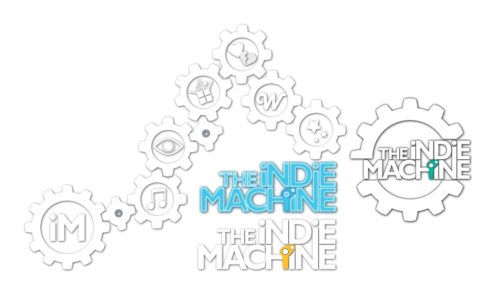
The original iM logo was designed prior to Price joining Marskell, but it was shortly into the summer of 2010 that the original designer (a student from Toronto’s art school OCAD) decided the operation was receiving much more recognition than she had originally thought, and that she now required retroactive compensation. Rather than deal with this increasingly absurd scenario where nothing had been stipulated in writing – and since Price not-so-secretly loathed the original logo – the night of the threatened legal action became the night the logo quickly shifted into the white hollowed “micro logo” that would be used on everything from the website to gig posters, and even the rubber stamp used to indicate entry payment at the door of concert events. Gears are obviously an essential component in many mechanical devices – the iM gears would have 12, 8, and 4 teeth respectively to represent the iconic musical numbers: 12 semi-tones in an octave, 8 notes in a traditional melodic scale, 4 musical voices (alto, soprano, tenor, bass). Each of these could then fit together in brand/advertising treatments, with 12 teeth gears for the logo, 8 for a sectional sub-icon, and 4 for an additional mechanical flourish.
Refinements to the full-name text portion of the logo shifted over the following week, eventually settling on a stacked block-y sans-serif typeface which linked the upper “i” and lower “N” together, which along with the single-colour camshaft component linking the lower “H” and “i” was intended to give the logo a more mechanical feel at its heart. After several months, this eventually led to a slicing of the “micro logo” to insert the full text into the gear boundary – leading to the final logo format currently used. The camshaft itself would go through several different colour shifts based on the primary highlight colour of each subsequent “version” of iM that was active online; or to highlight a particular colour-coded video series: red for the acoustic sessions, blue for the in-venue video series “WIRED”, and yellow for the interview mini-doc series “Input/Output”.
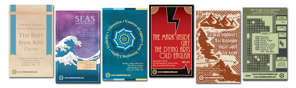
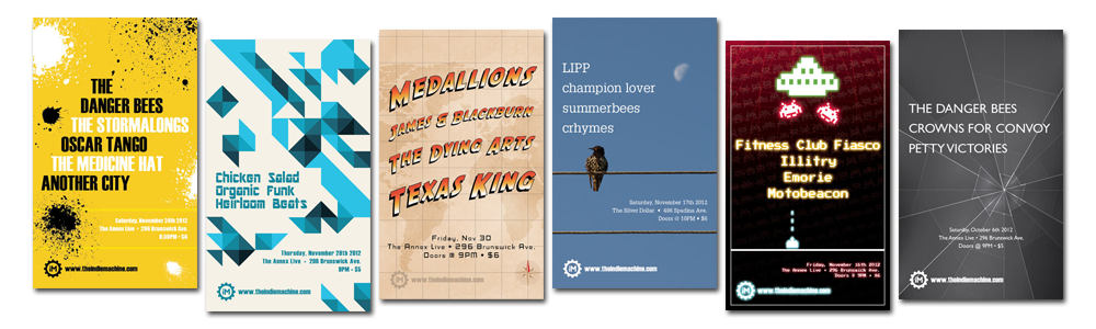
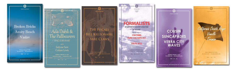
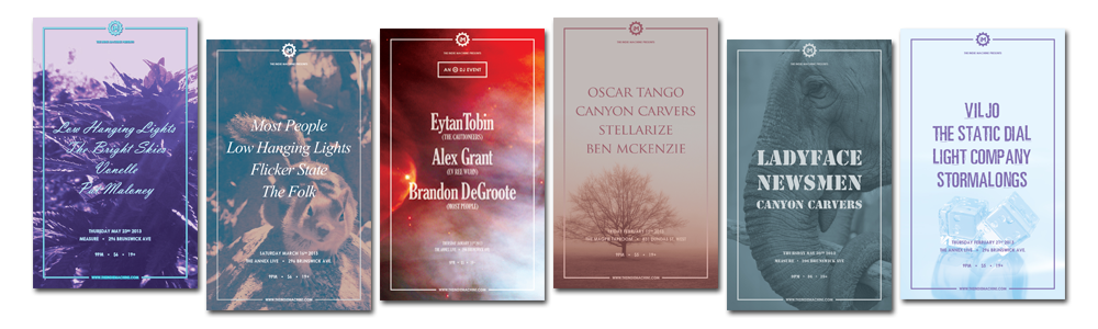
Many of the posters designed for The Indie Machine’s live music showcase series throughout 2010-2012 were built as individual design concepts extrapolating on a particular design technique or motif, or as an hommage to a particular film brand or art style. In 2013, with the number of showcases ballooning from 1 showcase a month at a single venue, to up to 15 showcases across multiple venues, this process was streamlined in favour of a standardized poster template with an inset stroked border line with the iM gear logo at the top and website at the bottom, and varying fonts and background images for each showcase.
The Website
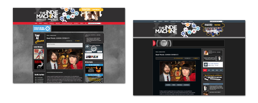
iM v.1.0 lasted about a year into the operation, and though ultimately the aforementioned reason for migrating onward to v.2.0 was not entirely under our own control, the basic black WordPress theme we used until October 2010 (of which no evidence remains) proved a simple and easily traversed forum for our thoughts on music. v.2.0 was a full revamp of the site from scratch that would fall in line with the redesigned iM branding – built from the ground up using what would ultimately become converted into v.0.1A of STRATASFEAR’s MODULUS framework.
It featured a basic blog feed with an authoring system to manage each author’s content independently, as well as a homepage carousel (before the jCarousel plugin became ubiquitous), Facebook events integration, a custom Twitter plugin (which became obsolete when they upgraded their API to require response keys), and – later into its lifespan – crude tabbed content boxes on the homepage and sidebars to cram more content in a smaller amount of space. However, the component we (and many readers) held most dear was the Flash-animated header complete with rotating social media gears. With the rise of the smartphone and the ever looming death of Adobe’s Flash format (which many smartphones couldn’t [or wouldn’t] display at all at the time), this header would go the way of the dodo with v.3.0 in the spring of 2012.
Further Upgrades
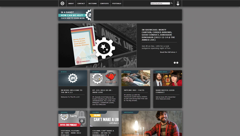
After the ever-increasingly convoluted mess that v.2.0 had become by v.2.8, iM v.3.0 was a complete reinvention. Built once again from the ground-up, v.3.0 allowed us to make several major refinements to the system: a full site gutting and element redesign, refinement of the crude tabbox structures to increase the amount of real-estate available in sidebars, and the removal of the Flash header which allowed for a cleaner, more robust menu system alongside a jQuery drawer pop-out at the top of the website. While this site wasn’t truly mobile in the sense of responsive design – it DID take mobile into account, as each section was tappable for a zoomable feature on both phones and tablets that would scale in to the container boundaries and allow for better legibility.
It was also around this time that we worked out a deal with a company called I-CONNECT.TV which would see both acoustic and in-venue iM videos adorning screens across Ontario PIZZA PIZZA stores, and another blog-contributing deal with TORSTAR’s alt-weekly publication THE GRID for their “Off The Grid” community content curation series – both of which are now completely defunct (a result of the ever-shifting journalistic scene in Canada and across much of the rest of the world).