Client:
The Birth of VenusProject Type(s):
- Branding + Identity
- Logo Design
- Graphic Design
- Web Design
Completion Date:
February 28, 2015Intro
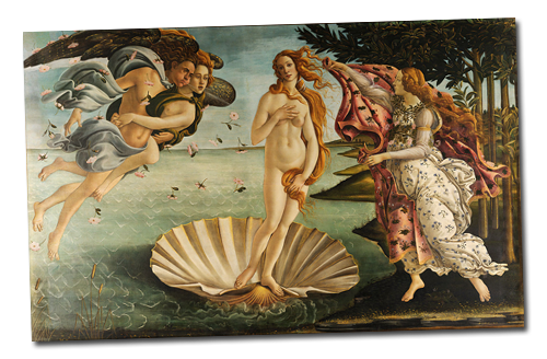
In spring 2015, writer/director André Schught and writer/producer Liz May were looking to put a visual stamp to the brand of their new film: a pseudo-retelling of the Shakespearean poem of Venus & Adonis, set in the contemporary porn industry, and infused with a layer of magical realism. Inspired by the classic Botticelli painting of the Birth of Venus, Schught and May were looking for something feminine, graceful, and powerful simultaneously; something that might capture the renaissance esthetic and the romanticism of Shakespeare but could also harken back even further to the Ancient Greek roots that inspired the original poem.
The Brand/Identity
In times before understandings of things like molecules and atoms, ancient Greek philosopher Plato theorized in his dialogue the Timaeus, that the four elements of the classical world (Earth, Air, Fire, and Water) were made up of groups of minuscule individual units each in the shape of one of the five known “Platonic Solids”: the cube, octahedron, tetrahedron, and icosahedron for each element respectively – the fifth (the dodecahedron) being suggested for the aether that would supposedly make up the heavens.
In 1596, German astronomer Johannes Kepler proposed a model of the solar system (of the five known planets at the time) in which these same five solids were set inside one another and separated by a series of inscribed and circumscribed spheres (the first recorded attempt at trying to explain the orbits of the planets as ellipses). In this model, Kepler assigned the icosahedron to the planet Venus.
Seeing the correlation and all of the obvious collisions of these disparate ideas – the goddess Venus, femininity, Greek philosophy, water, astronomy, the planet Venus, and the seeking of answers both microscopic and universal in nature – we concluded that the icosahedron would be integral to the branding for the film.
The Logo
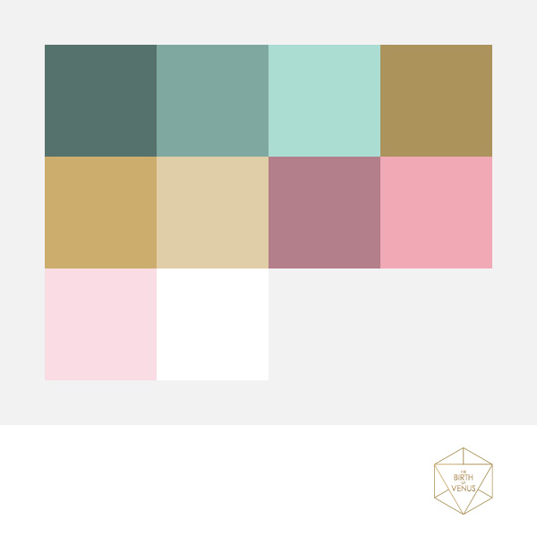
Arguably “good” logo design is simple and can be reduced to its key symbols, but the team were looking for something inherently complex to begin with: our solution was to create something that could be layered to be more complex at larger replication sizes, with its less important elements stripped away as the logo were reduced in size for smaller applications. Thus, The Birth of Venus logo breaks down into several key components: first, the rear layer is comprised of an interconnected network of dashed lines which serve to connect each point of the two-dimensional icosahedron to each and every other point on the shape. The six circular junctions serve to highlight the equilateral hexagon faces that makes up each of the shape’s 20 sides, and in combination with the inner 7 circles form the framework for a sacred geometry shape called a Metatron’s Cube – which is referred to by some New Age practitioners as the “Fruit of Life”.
The front face of the shape received a solid white line with an overlain golden triangle on top to reflect the Greek fascination with math and science in their pursuit of universal truth, while the female figure with arms outstretched to the heavens in the foreground is inspired by Botticelli’s original painting of Venus emerging from the clam shell in the sea; the triangle of knowledge here standing in for the clam as the mechanism of rebirth. All of these elements are present in the full scale representation of the logo, while its smallest format only the title treatment and core solid-line icosahedron remain.
The ideas of both Plato and Kepler are personified here with this treatment – summed up best by Plato’s quote “God geometrizes continually”, his suggesting that the creation of the universe by a divine being is reflected through the geometric shapes in nature: what better way then for a goddess to recreate her own self, than through the same means.
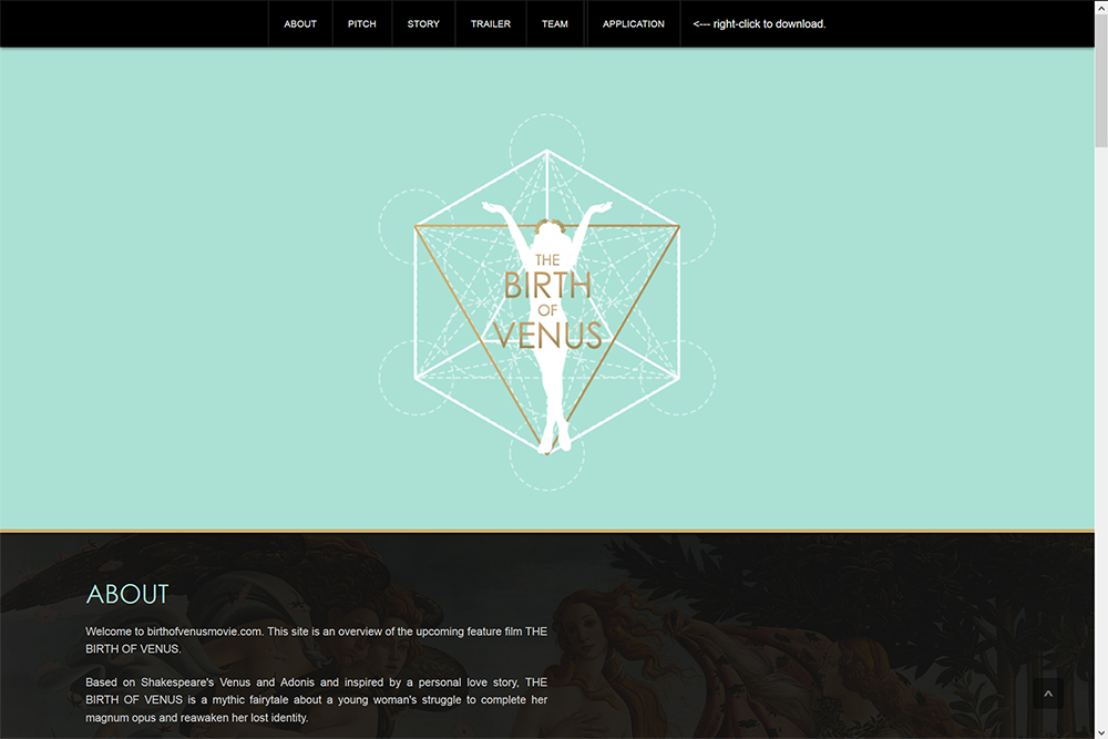
The Website
As the film was still in its early stages of development, the key goal for The Birth of Venus website initially was to house basic information as the team built up its materials ahead of production. The Birth of Venus website is a single-page build on v.0.6 of our proprietary MODULUS framework which features a few simple panels of information on a vertical layout with an auto-scroll menu system adorning the top of the website. However, because it was built using MODULUS, many additional features lay dormant under the hood, and merely need to be switched on once the production has advanced enough to require them.
The back-end of MODULUS here can serve as an on-going project blog, that could be divided down categorically even further for different streams of interaction with fans through the different sections of the film production team, along with various “widget” like components added to the homepage to highlight these new content features. A built-in carousel and photo galleries would also help further down the road should the production team get into fundraising through crowdfunding campaigns, or into investor pitch meetings and grant/funding application submissions.