Client:
Science RendezvousProject Type(s):
- Branding + Identity
- Logo Design
- Graphic Design
- Web Design
Completion Date:
May 13, 2017Intro
In spring 2017, Canada’s largest science festival – Science Rendezvous – was looking for a change. Founded in 2007 by Prof. R. J. Dwayne Miller – a professor of chemistry and physics at the University of Toronto, and Director of Atomically Resolved Dynamics for the world-renowned Max Planck Institute for the Structure and Dynamics of Matter in Germany – Science Rendezvous’ mandate is to encourage the public (both children and adults) to learn and interact with science in their community. This occurs in the spring every year across the entire country with a one-day festival in conjunction with partnered education institutions (colleges, universities, libraries, et al) to help the public learn about new research and concepts in fun and exciting ways.
Having just received a grant from NSERC (the Canadian Federal Government’s National Science and Energy Research Council) in time for their 10th anniversary, Science Rendezvous was looking to do a full overhaul of their website and to give all of their branding materials a much-needed modernizing facelift.
The Brand/Identity
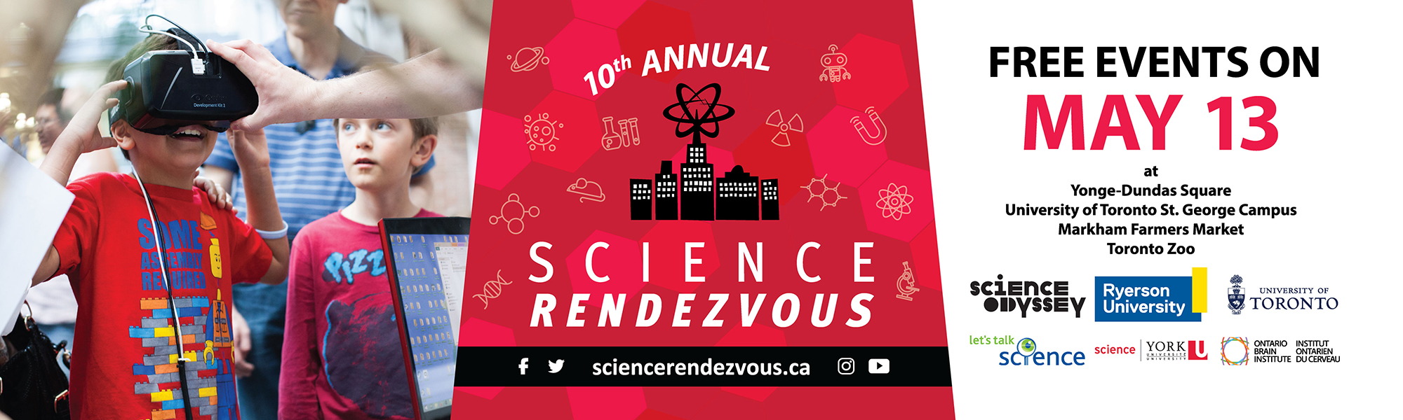
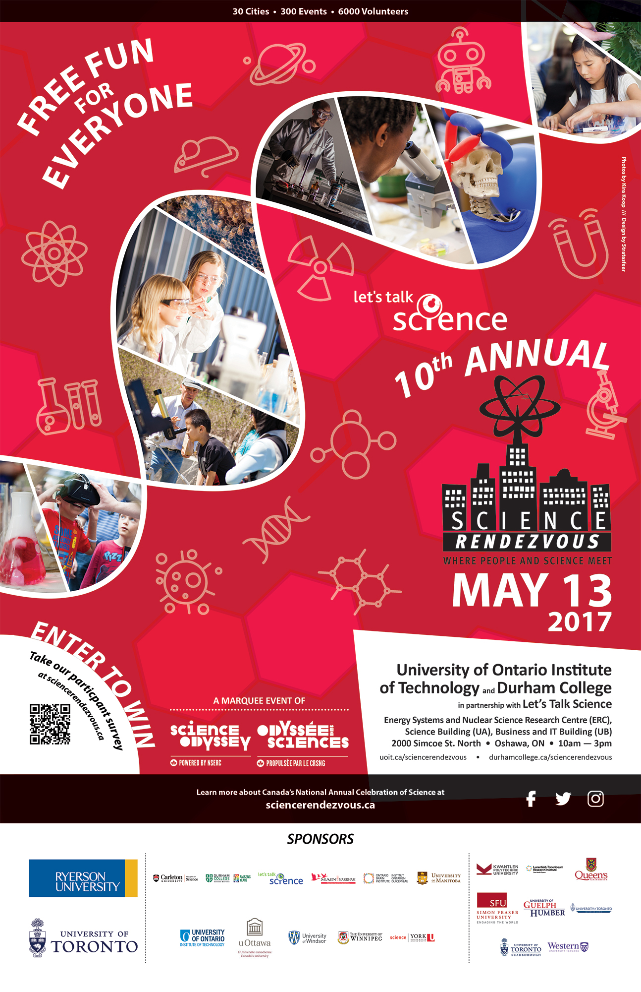
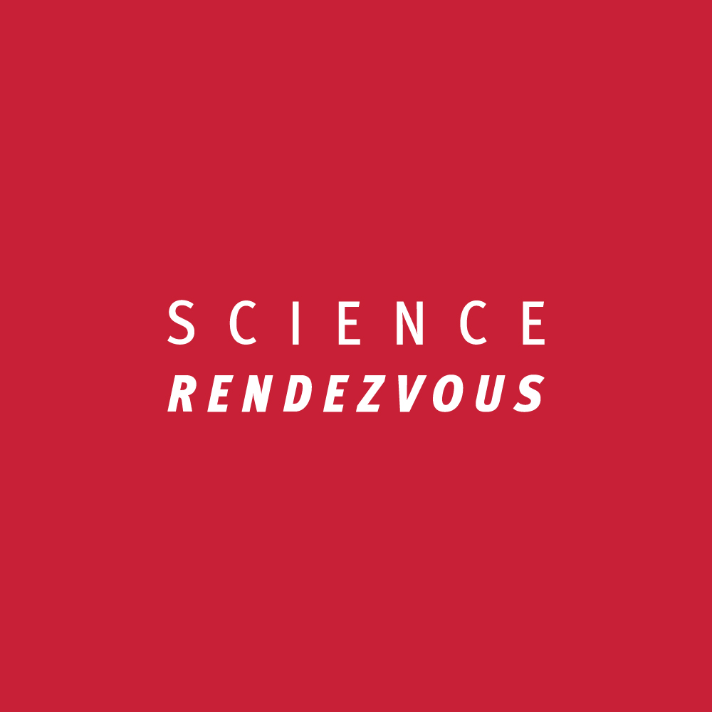
The original logo had stood since the festival’s inception, and its pastel colour scheme felt both dated and difficult to integrate into promotional materials – in particular when used in conjunction with other companies’ branding. Stripping the logo back to its core elements and running it in both single-tone black, white, and two-tone black-and-white variations allowed for a much simpler application of the brand. Coinciding with the Canada 150 celebrations, we also pared the brand back to a key red colour throughout all applications of the marketing and promotional materials to help unify the brand under a Canadian motif for better public perception as Canada’s leading science festival.
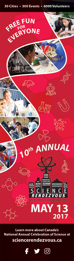
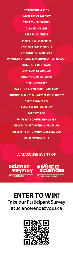
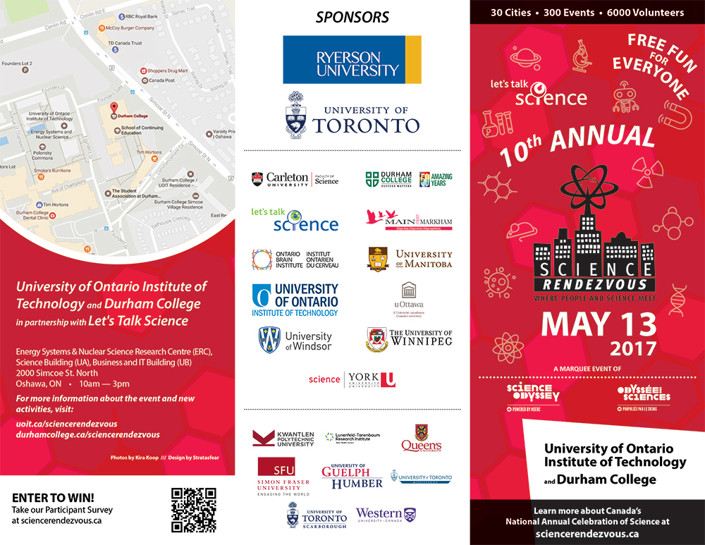
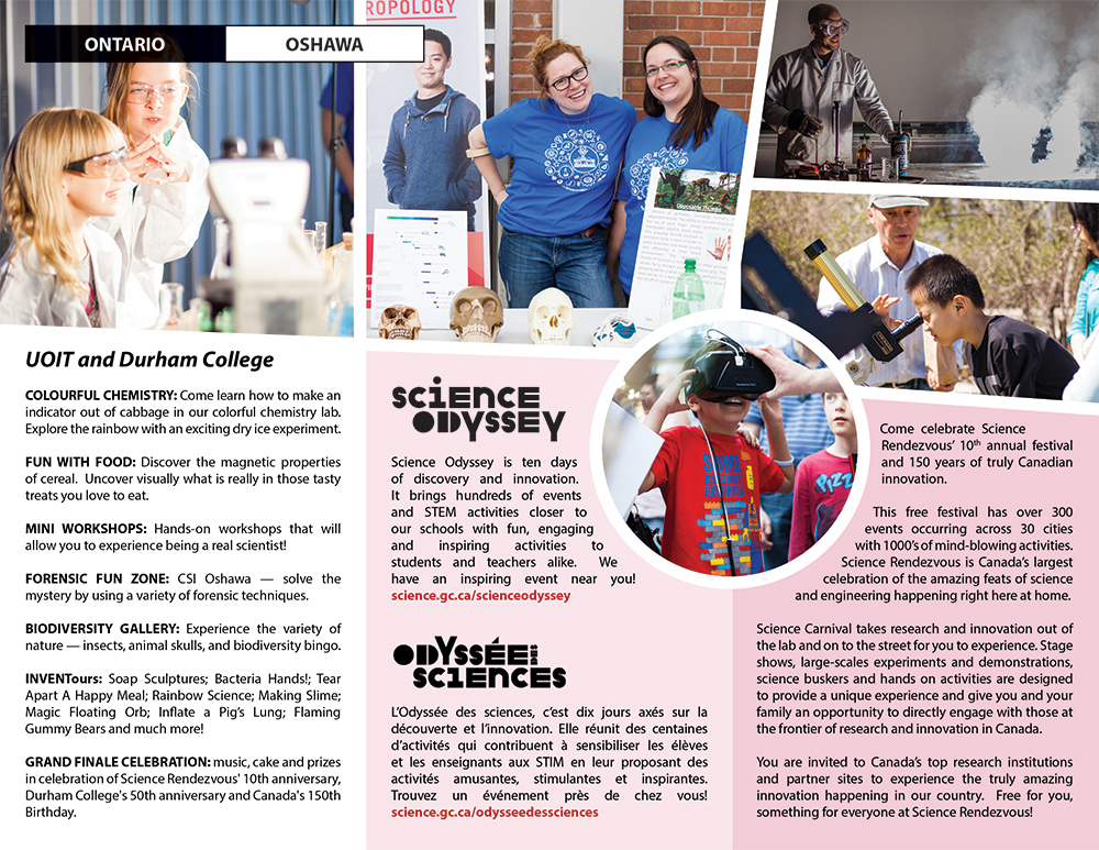
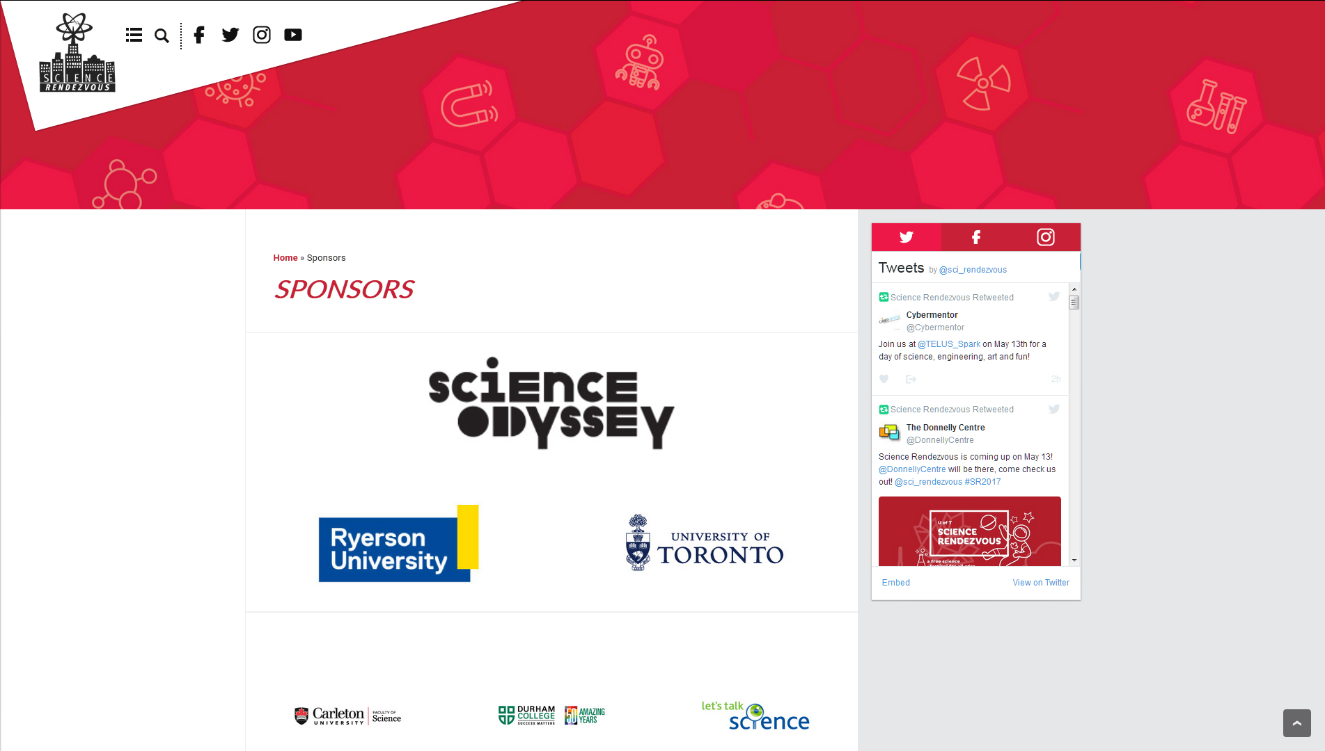
Additional marketing materials for the festival included bookmark handouts, a promotional brochure for advertising and garnering sponsorships, static and video billboards for use around cities and on local transit systems, and individualized brochures and posters for each event site advertising the activities one might experience at each respective event site.
The Website
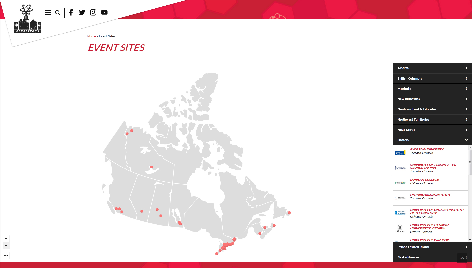
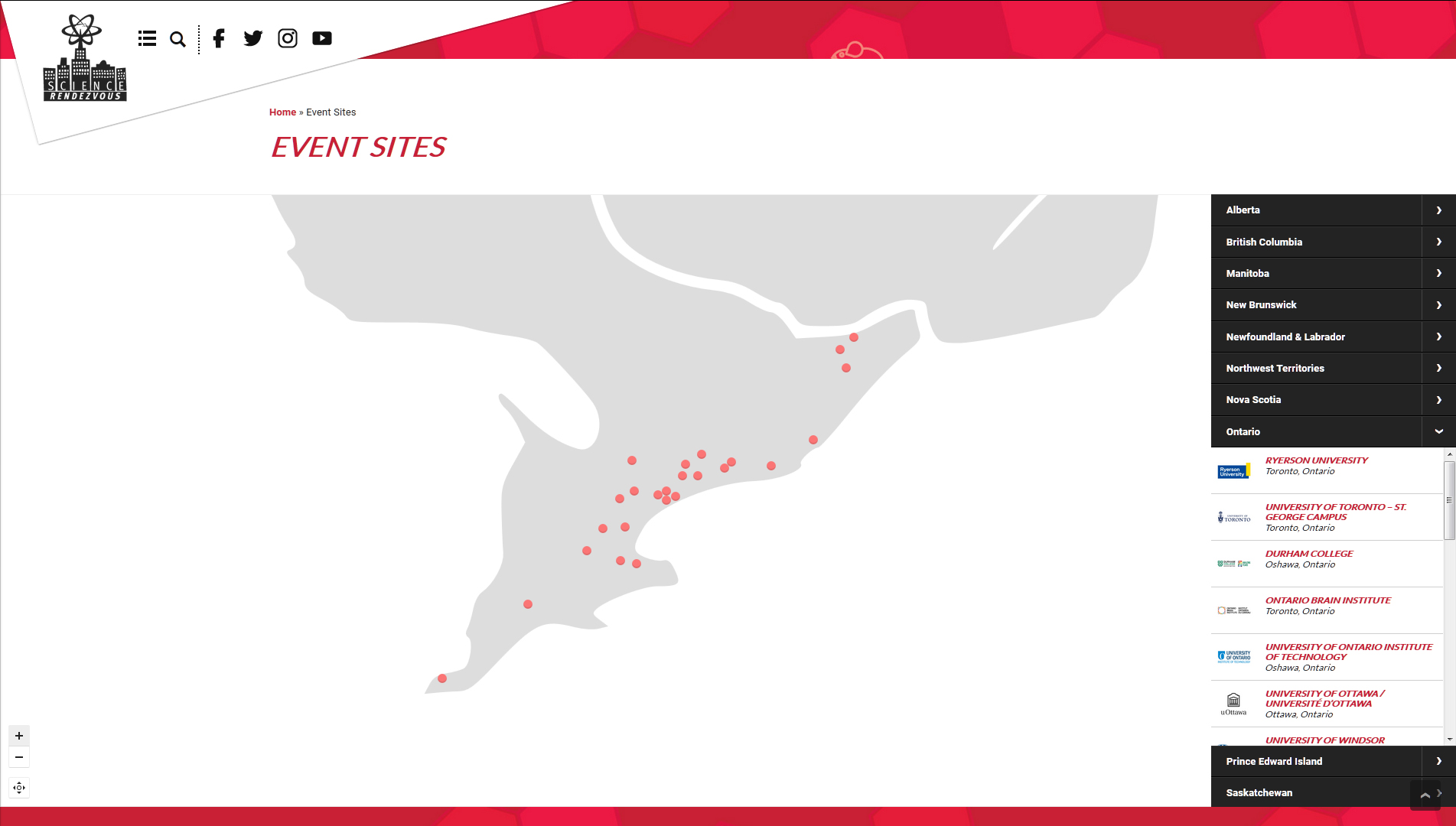
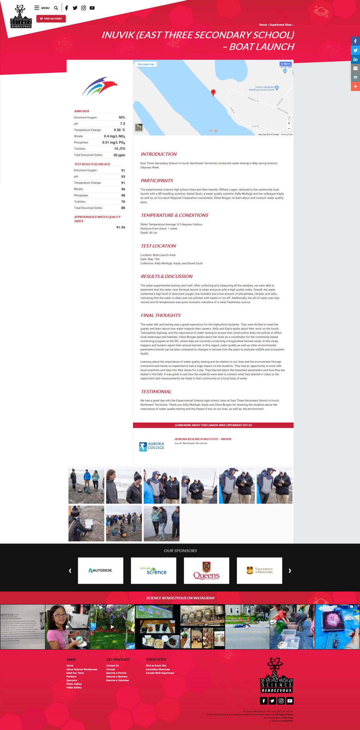
The Science Rendezvous website is built on v.0.7A of Stratasfear’s Modulus framework. This version of Modulus features an enhanced mobile menu and a robust sponsorship system, in addition to Science Rendezvous’ request for multiple integrated microsites: the first to highlight their NSERC Innovation Success Stories – profiles of scientists and their work that would be promoted on-site at different event sites – and the Canada Wide Experiment – a national experiment investigating water contaminants and material values at different sites across the country in order to assess and evaluate the quality of Canada’s water and our impact on each different environment.
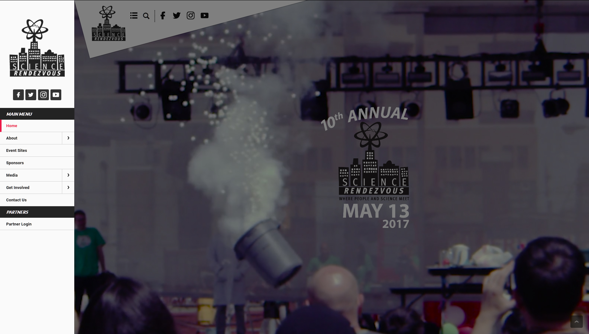
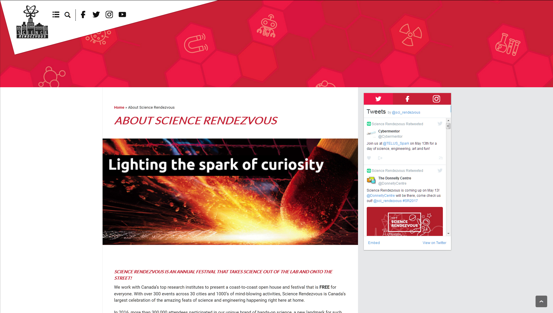
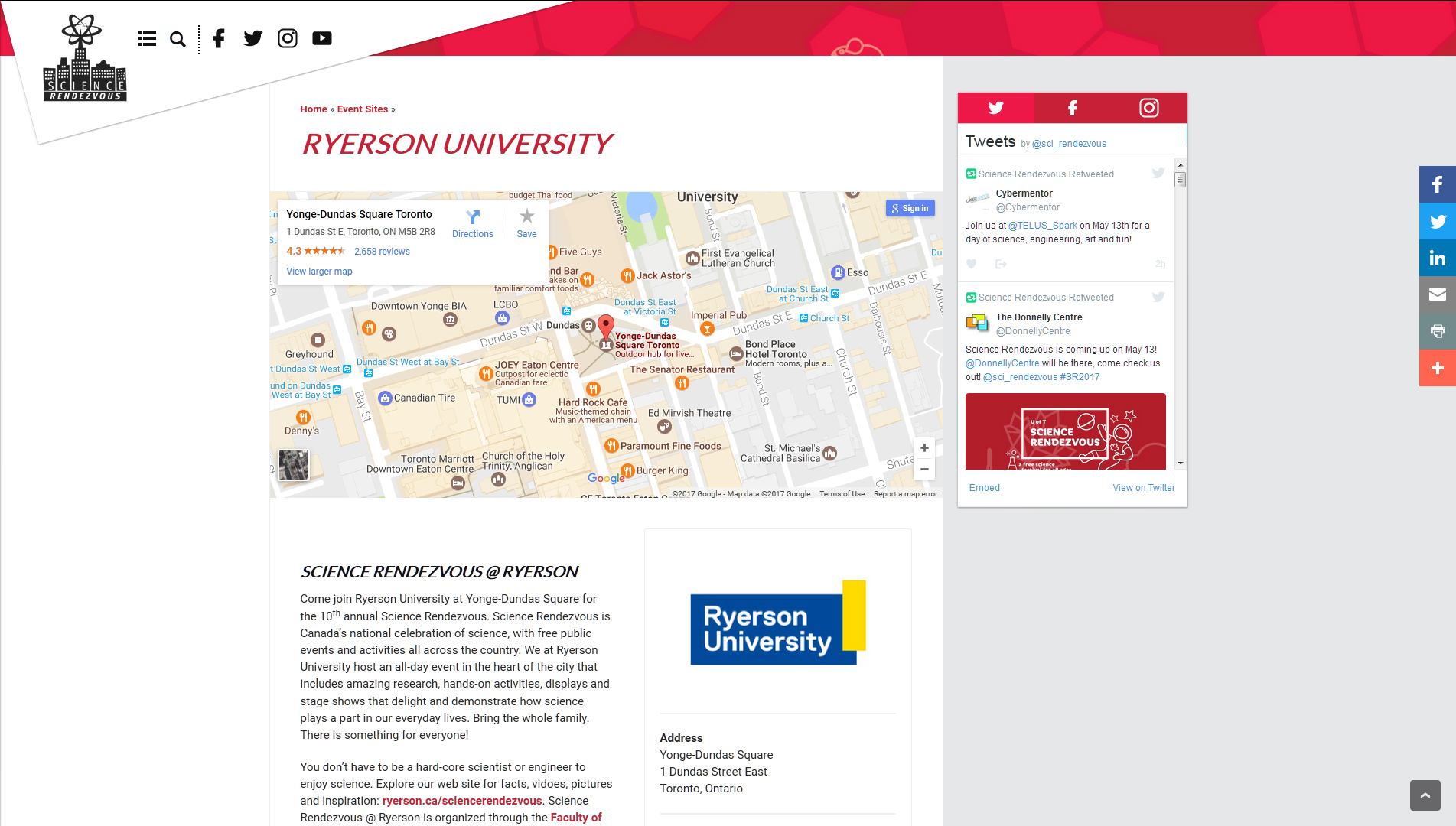
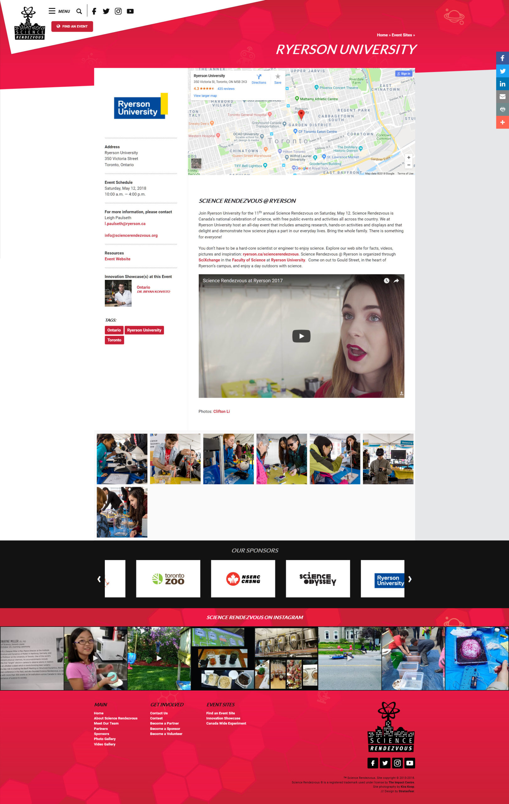
The homepage of the Science Rendezvous website features a full-screen video header on loop that showcases some of the activities one can experience at Science Rendezvous events. Each event site is also promoted through a custom-built profile system where event site managers can log in to the WordPress system and update their respective event page with location details, photos, videos, descriptions, local contact information, and additional downloadable materials about each event.
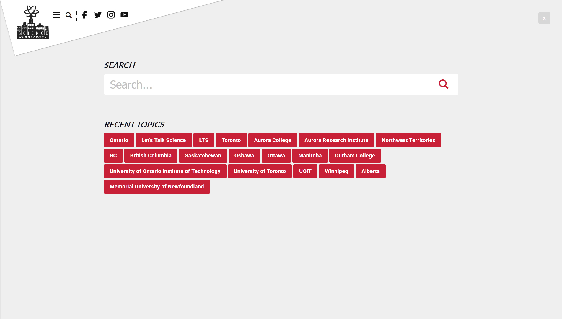
Links to access the menu, the search panel, social media profiles, and to quickly return to the homepage are accessible from the top-left of the website in a controller component we called “The Shard”, which is extrapolated from an inversion of the white geometric object present on the posters and brochures used to house the location identified information for each respective event site.
2018
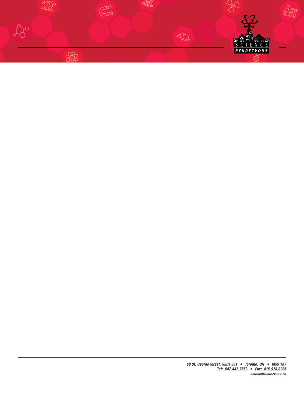
Moving into 2018, we refreshed Science Rendezvous’ branding package: streamlining the logomark for better scalability/legibility and creating a separate usable standalone wordmark – each in black, white, and red variations. This also included building new letterheads for the organization’s print materials, and updating all logo usage across the website.
For the website itself, we added in some of the newer components from the latest Modulus Framework build (v.0.89), which included an enhanced menu and search system, upgraded social media features, additional animation flourishes, a video embed scaling script rework, a reworked (more condensed) page header system, and an overhaul of both the Event Site and Experiment Site profile page designs. These new “Site” page layouts dropped the Social Media sidebar in favour of pushing the “quick info” block for the location into its own Sidebar component that would scoll-and-lock with the user as they viewed the page, as well as a separate gallery component that would allow for a separate lightbox gallery section on each profile page.
The posters, brochures, and bookmarks for the 2018 event would carry over the basic designs from the 2017 redesign, but would include some slight tweaks to ameliorate legibility issues and weighting with the previous year’s design, and to accommodate for the increased number of sponsors listed for the 2018 event.