


Client:
HMFF (Hamilton Music & Film Festival)Project Type(s):
- Branding + Identity
- Graphic Design
- Web Design
Completion Date:
August 25, 2017Intro
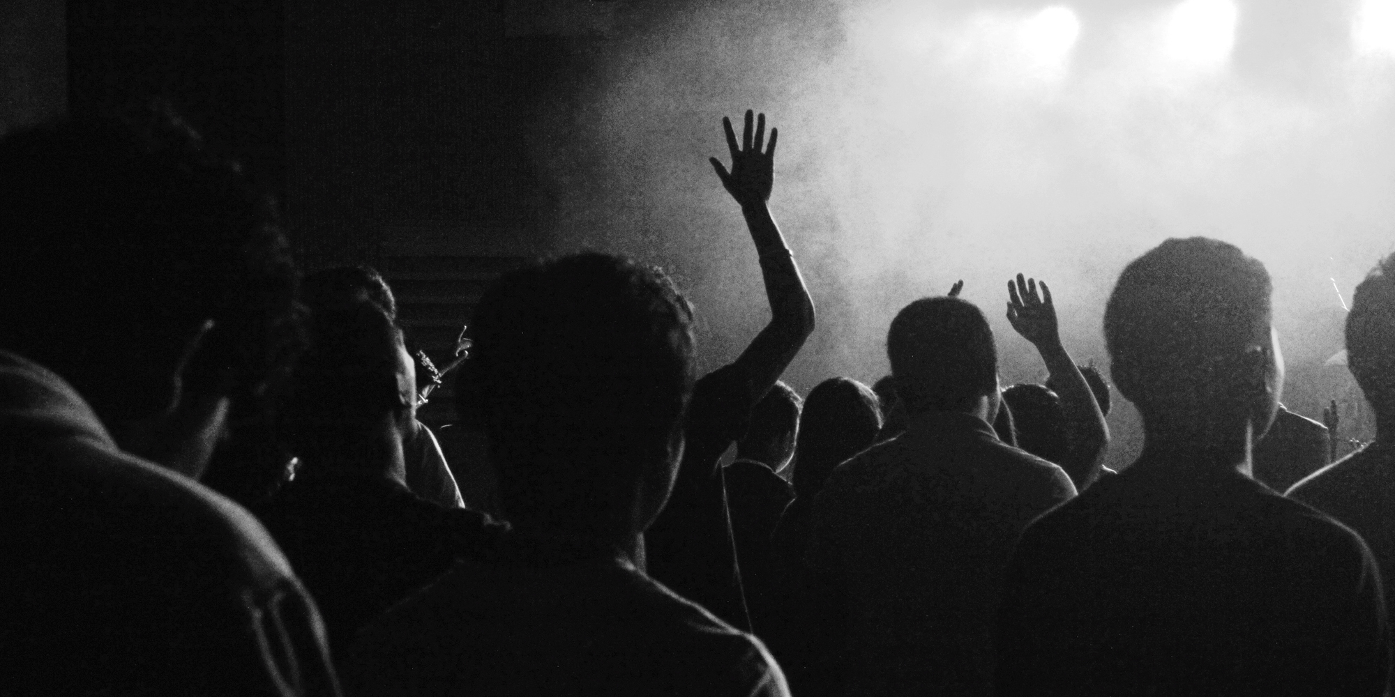
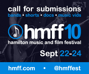
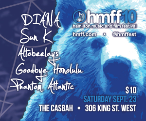
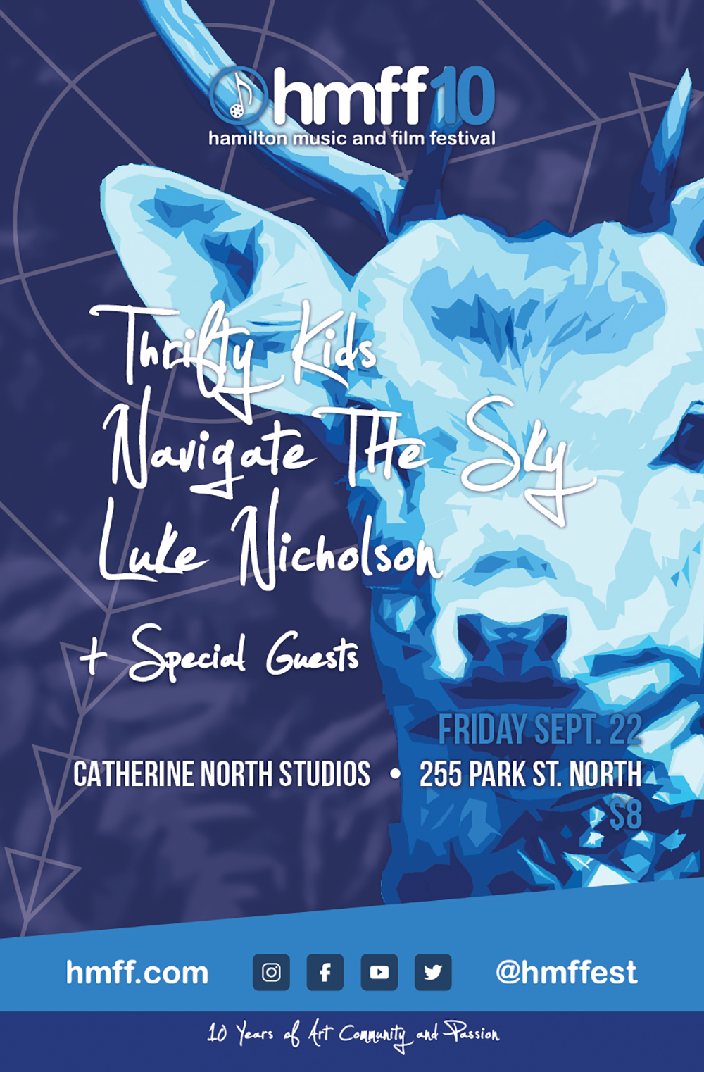
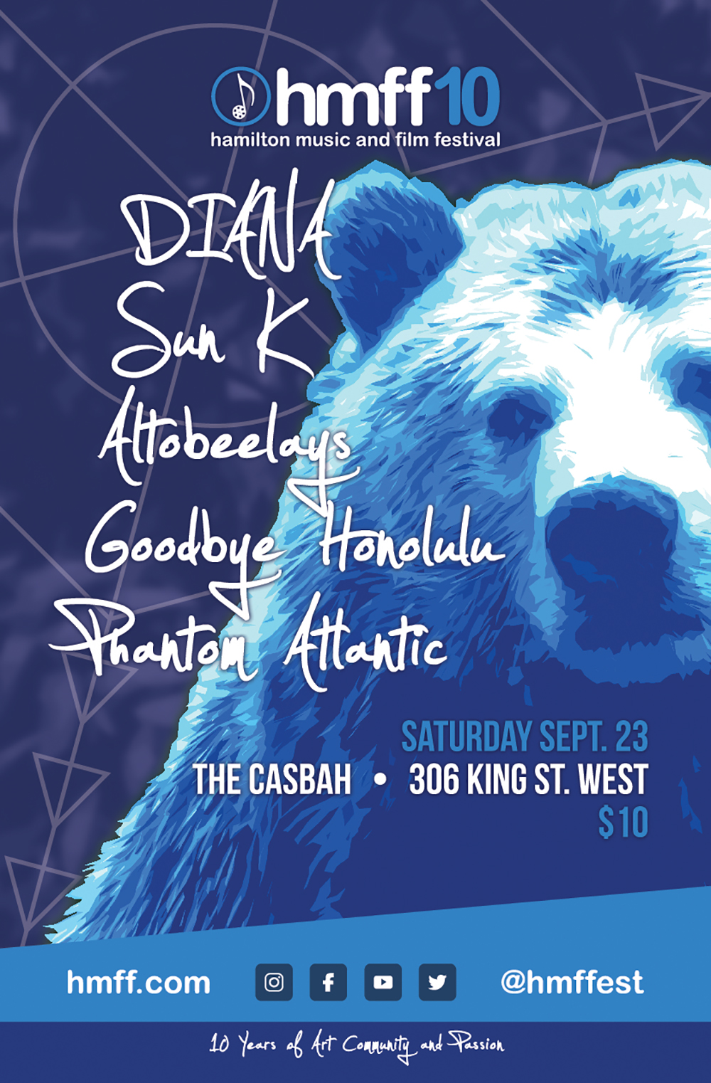
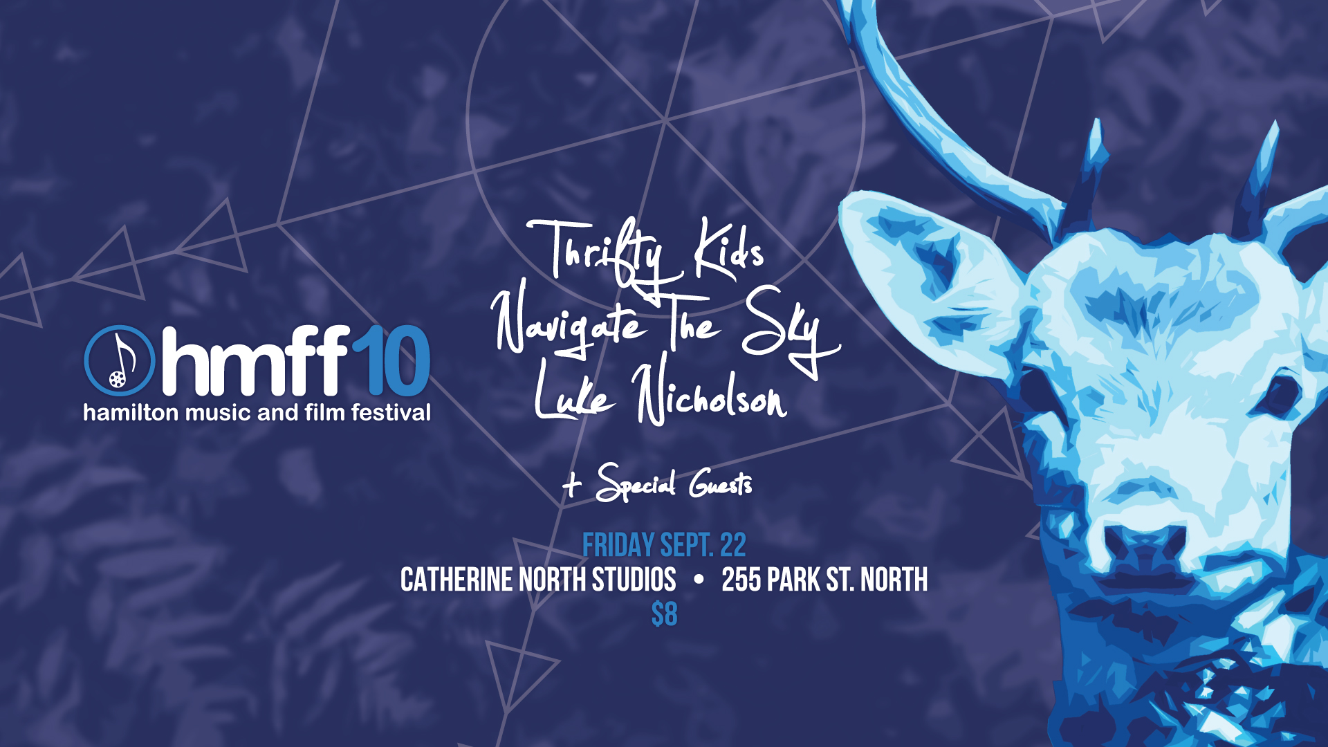
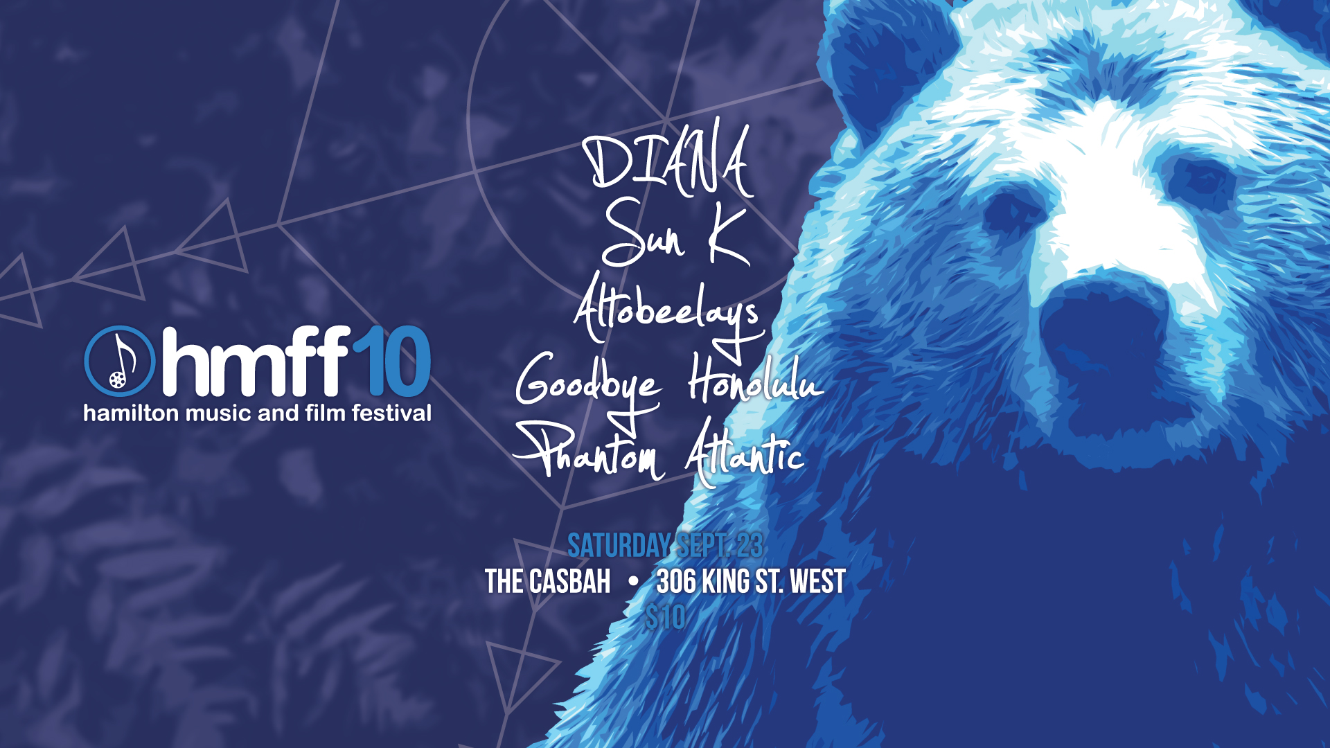
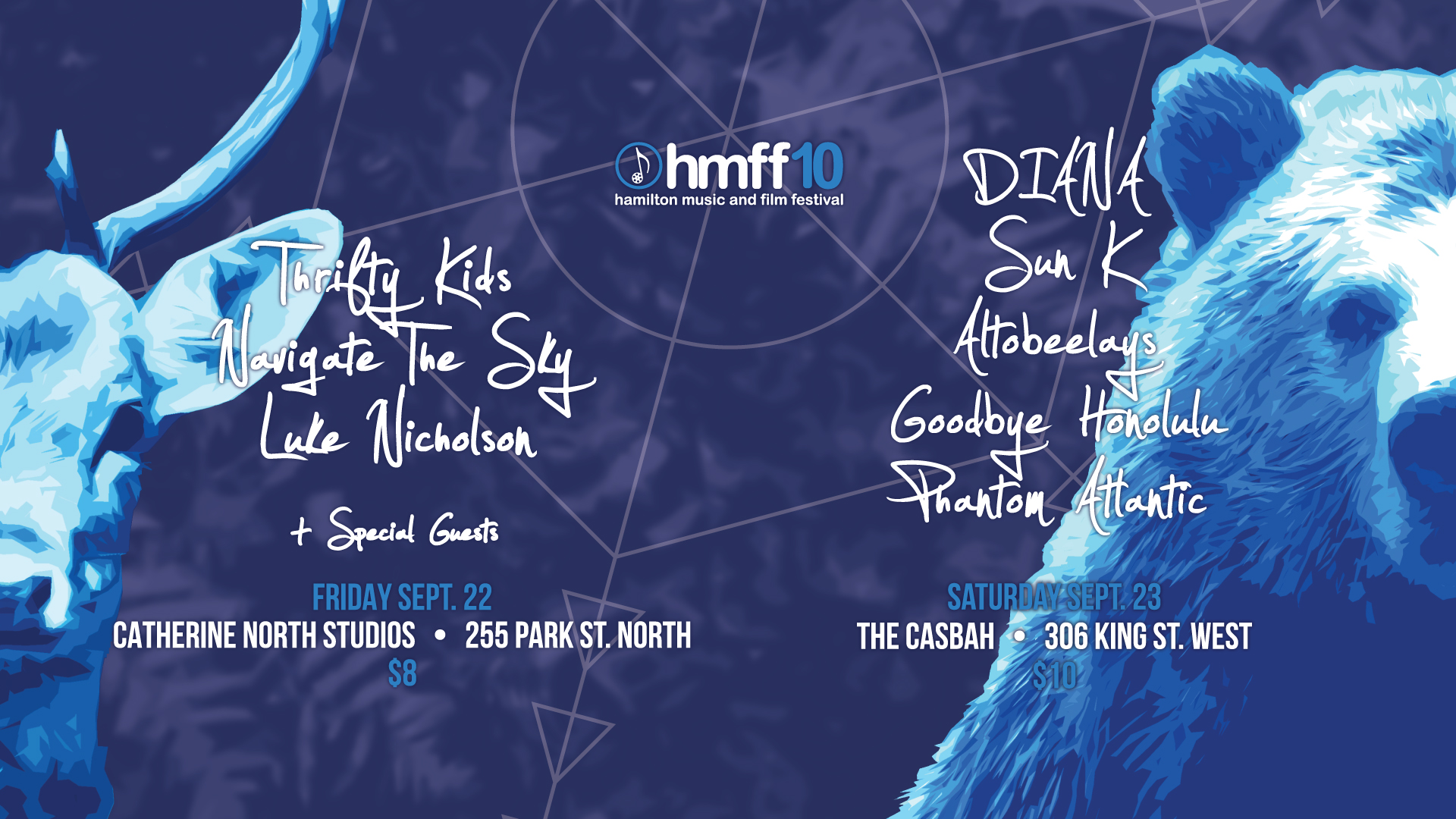
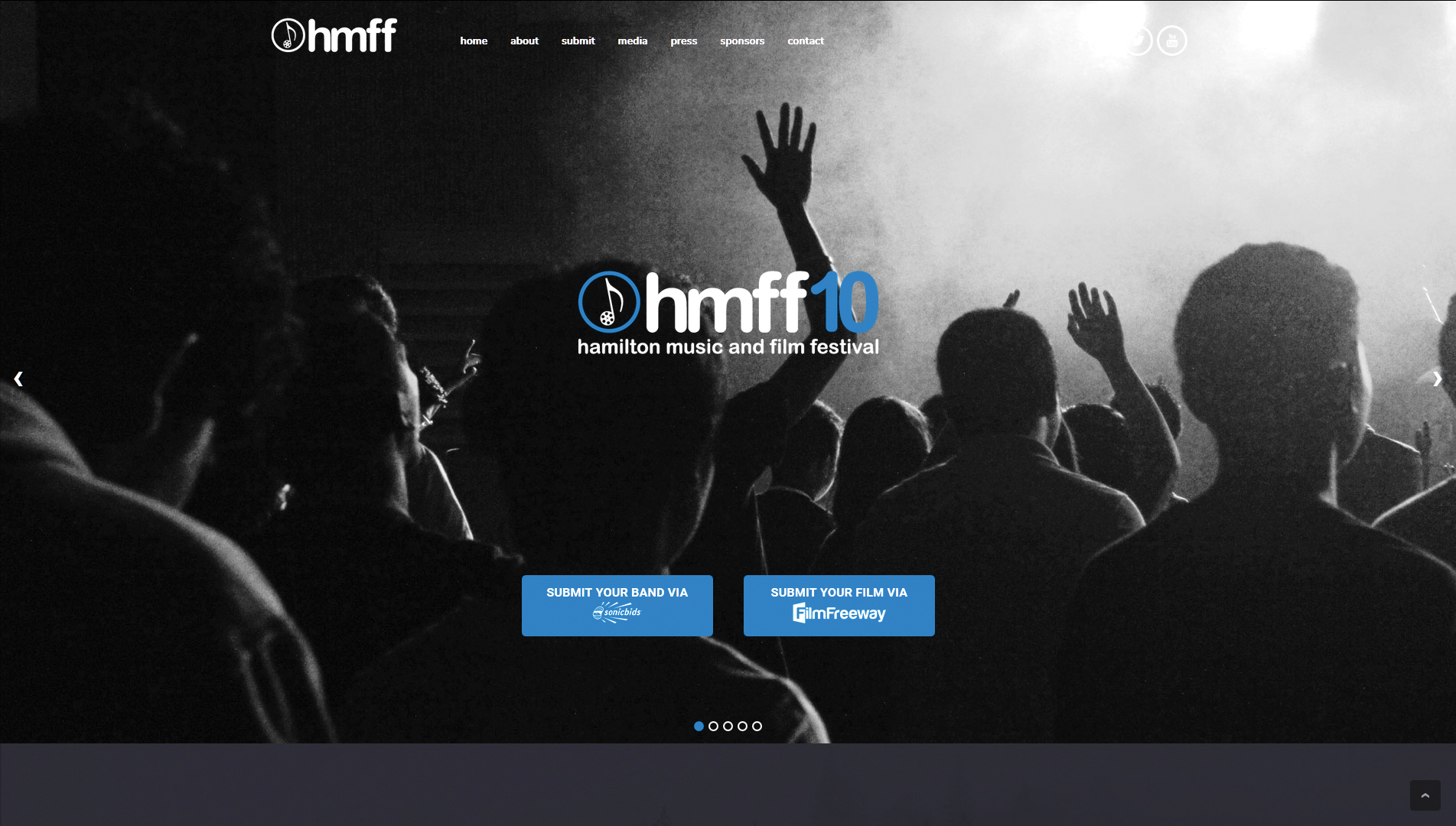
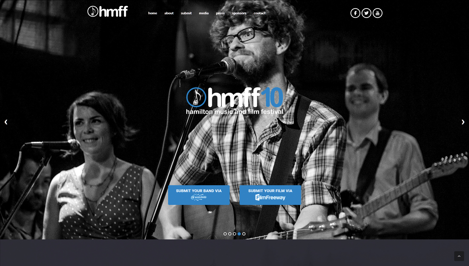
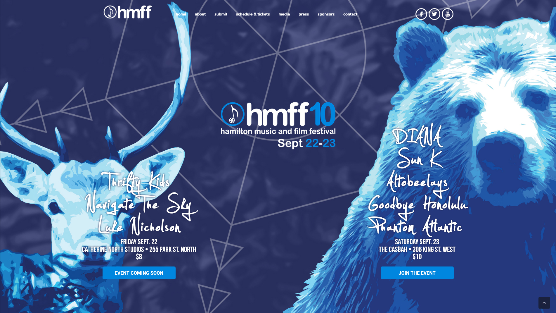
In 2017, for their 10th anniversary, the Hamilton Music & Film Festival wanted to develop an all-encompassing look for their event: something clean and modern, but heavily stylized; something that would be as equally eye-catching as a small ad on a website, a poster on a bulletin board or telephone pole, or on the event’s website itself.
The Branding/Identity
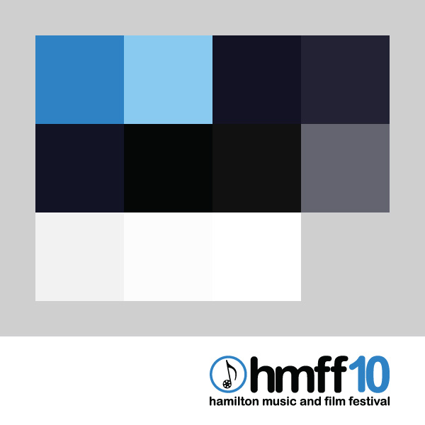
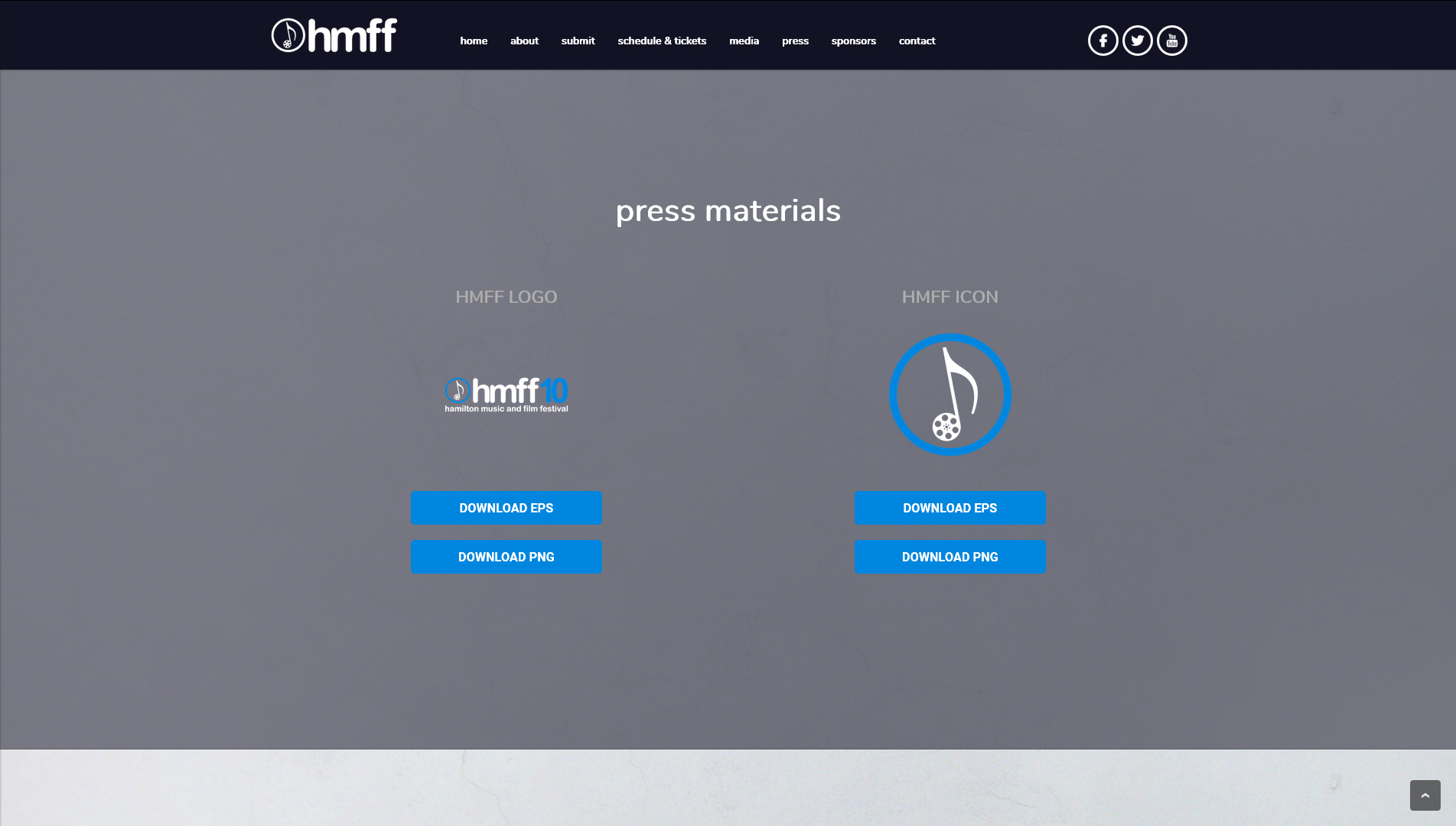
HMFF didn’t have access to a vectored version of their logo – suspecting that it may have been saved on a missing or damaged hard drive. We started out by rebuilding and touching up their pre-existing logo with a lowercase Arial rounded font and selected a bright blue colour for a call-to-action tone as the year’s “theme colour”. Next we integrated some of the festival’s past photography for some initial advertisements and website content panels before developing the artistic design of the grizzly bear and deer which would be used for posters, ads, and social media
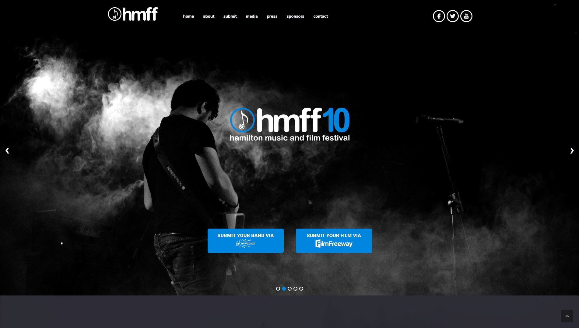
The Website
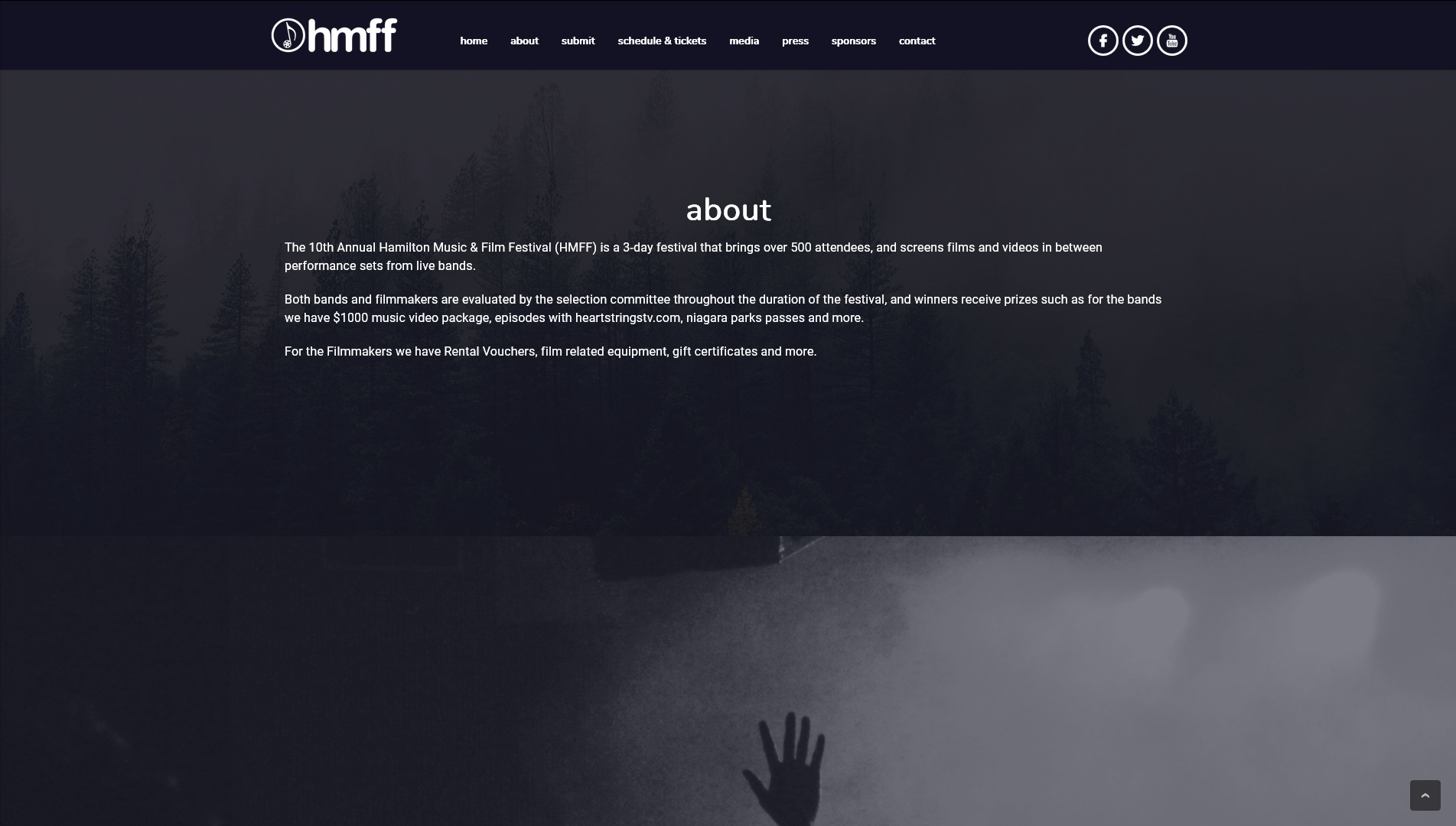
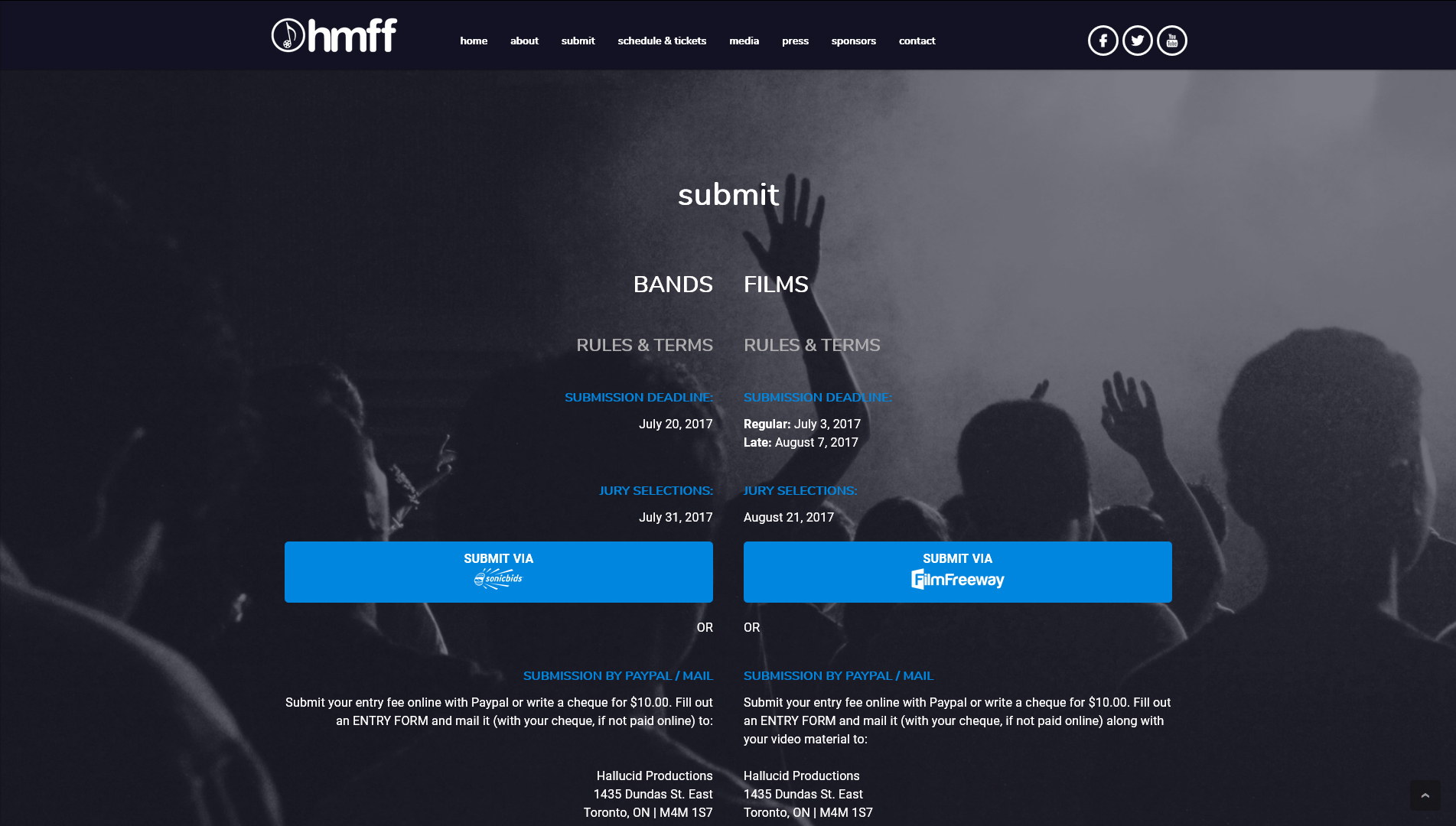
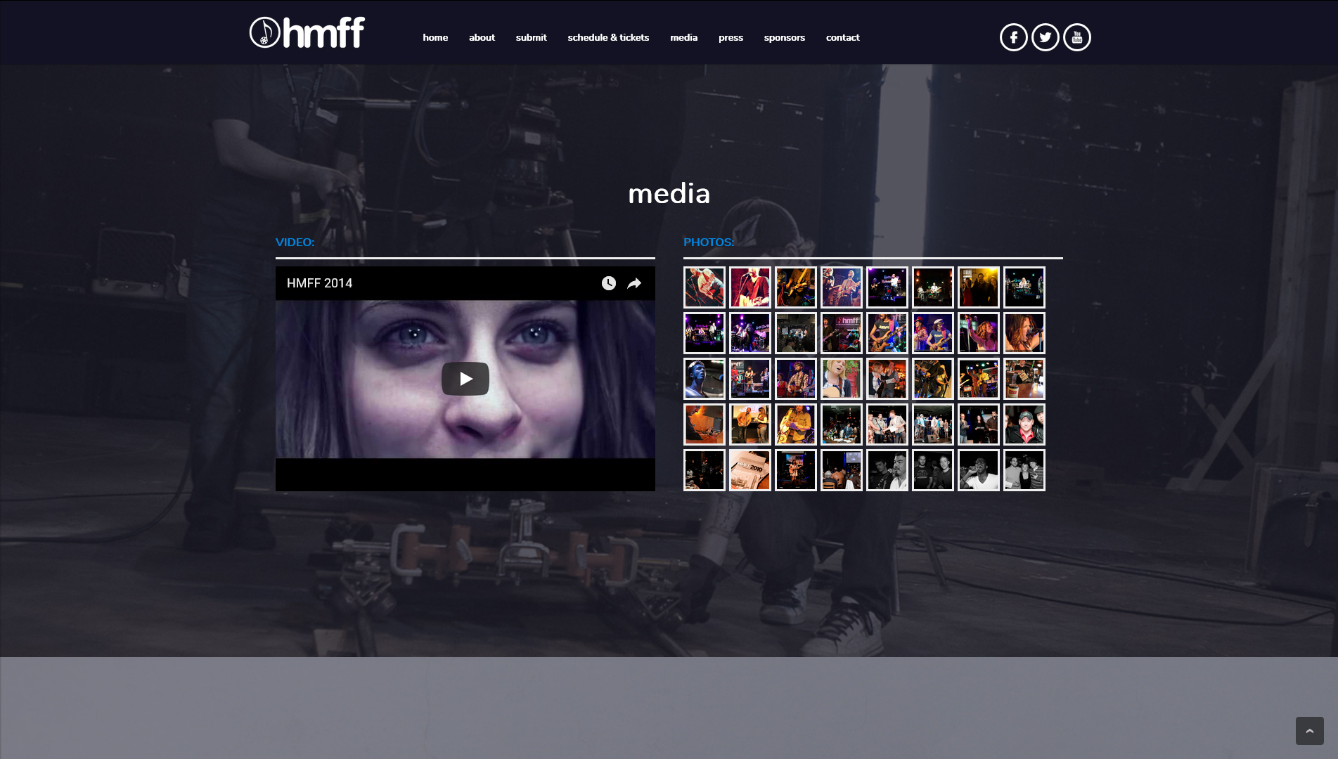
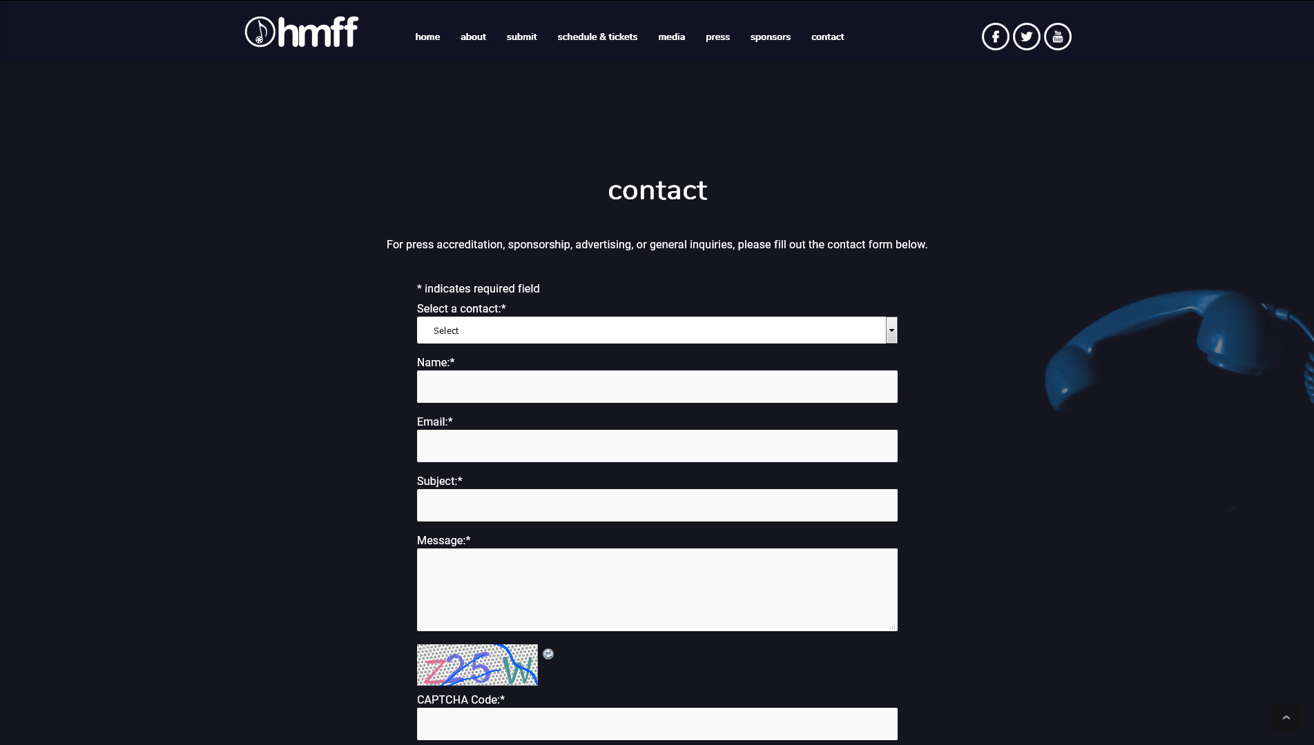
The HMFF website was already running WordPress, so we developed an installation of Modulus v.0.75 as a single-page website with auto-scroller menu that would highlight the two-track nature of the festival: submitting both bands and films to the festival for consideration and subsequently listing them out once the festival announcements had been made. The lead panel features a vertically-centered event logo and call-to-action layered atop an auto-rotating full-height carousel, a photo gallery of select past event photos opens in a jQuery lightbox component, and a simple sponsorship system allows for adding sponsors/logos/links and assigning them to different tiers of sponsorship. The auto-scroller menu system was also expanded for mobile into a component we call the “inlineMenu” which opens a drop-down on initial mobile device click, and then collapses and auto-scrolls to the corresponding section when one is selected from the drop-down.
Once the music selections had been announced, the intro panel of the website was updated to match the poster/social media creative of the deer and the grizzly bear – with either side of the panel providing the basic event info and a direct link to the Facebook Event page where tickets could be purchased.
