


Client:
FAJO MagazineProject Type(s):
- Branding + Identity
- Graphic Design
- Web Design
Completion Date:
November 30, 2013Intro
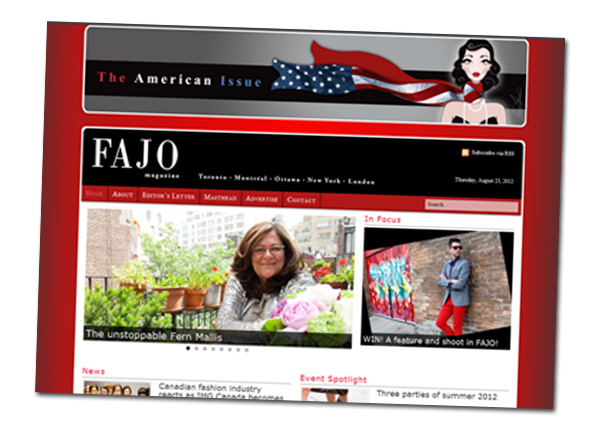
Founded in 2010, Canada’s leading digital fashion magazine FAJO sees over 250,000 unique visitors every month from North America, Europe and Asia. STRATASFEAR was involved from the start as a creative advisor, helping the team plan out their initial website and design elements, but we were unable to execute the initial build for them due to scheduling conflicts.
Flash-forward to the spring of 2013, and editor-in-chief Hannah Yakobi was looking for a massive overhaul that would eliminate the headaches of updating small aspects of their pre-existing WordPress website and improve the user experience for their readership. After a new round of discussion, it was obvious that it was time to dust off our initial design plan and put it into action.
The Brand/Identity
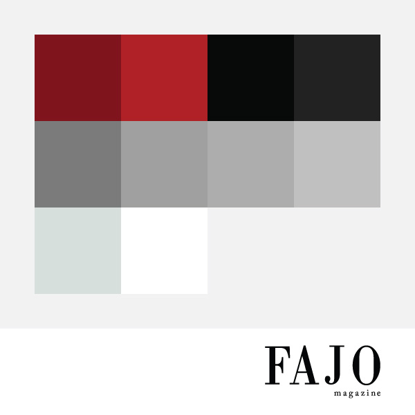
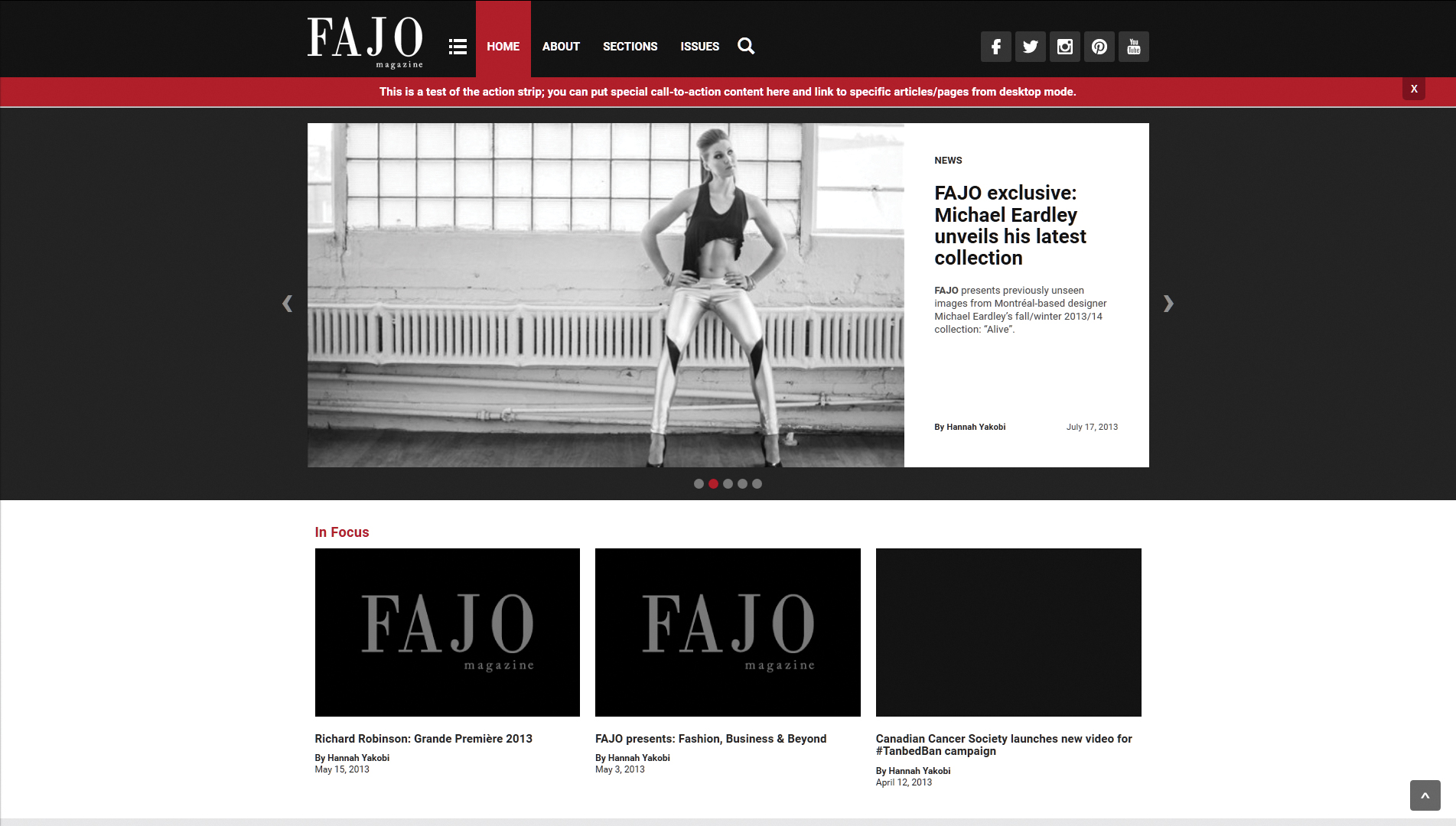
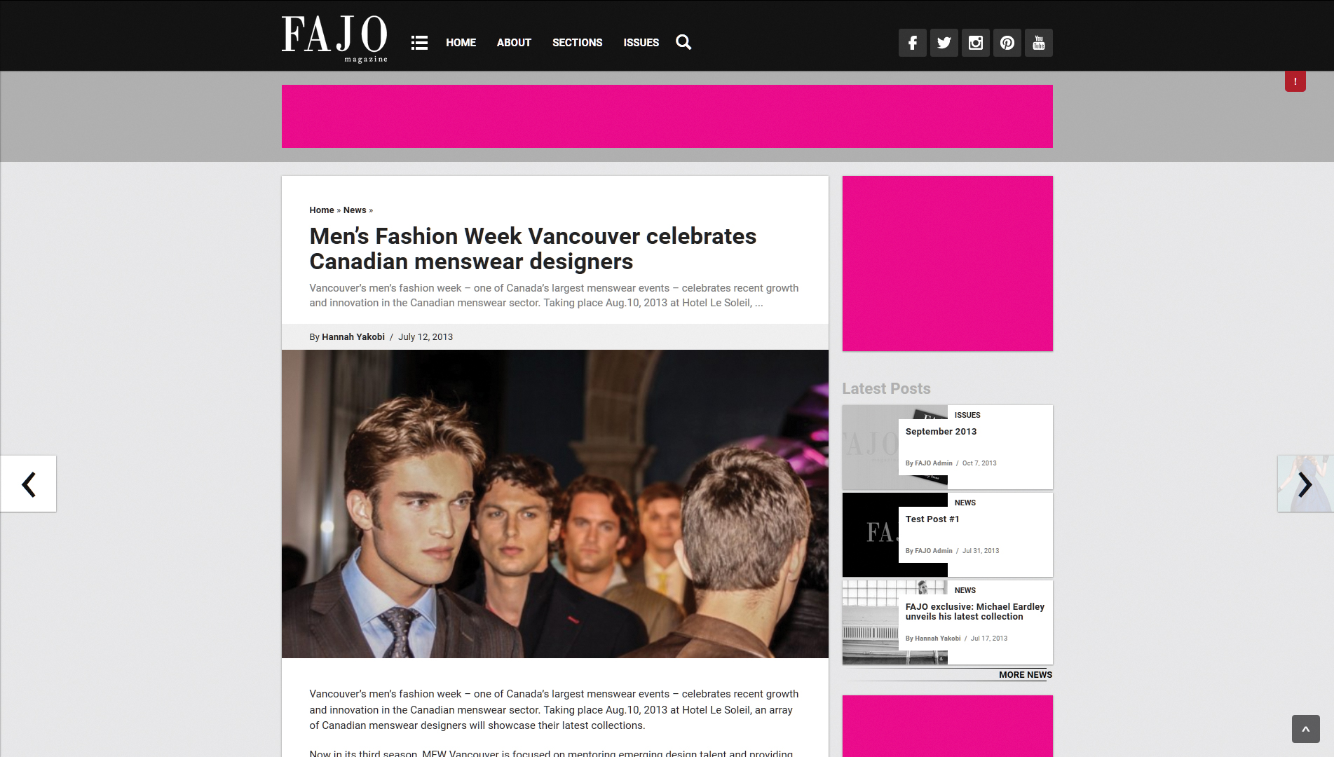
The core layout of the pre-existing site had already been established because of our initial talks in 2010 – so in our 2013 build the idea was to merely translate this to a streamlined modern look, and to remove any unnecessary bulk so that the content could do the talking without any impedance. Ultimately this meant that the colour palette would be reduced from the first website’s abundance of colours to the more contemporary core black/grey/white motif with the originally overpowering red gradient background removed in place of the red tones being isolated to two specific shades which would be used as rest/hover state accent pieces for the lock-and-scroll menu bar, headlines, site divider lines, and links around the website.
This rich palette of grey tones with a subtle drop shadowing allowed for the stacking of elements in an almost three-dimensional nature – somewhat akin to Google’s “material design” initiative – with rounded corners on body content elements to soften their visual flow as they stacked alongside each another in an apparel-like manner.
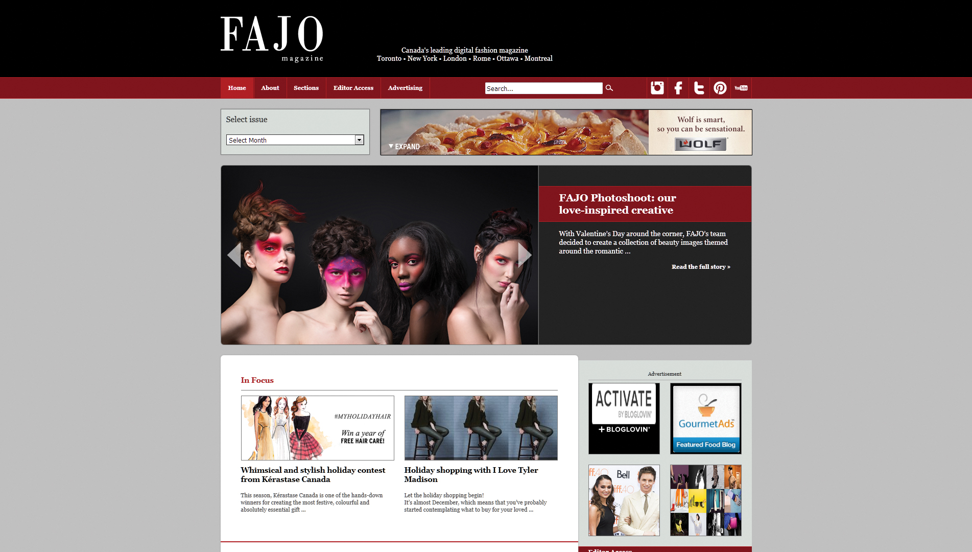
The Website
The 2013 redesign of FAJO Magazine ran on v.0.5A of our proprietary WordPress framework MODULUS. This particular configuration features a homepage “featured articles” carousel, lock-and-scroll menu + sidebar widget (for newsletter sign-ups), and fully-customizable advertisement placements. The homepage design allowed for fluid expansion: as the site generated new categories of content organization, or updates in pre-existing ones became more frequent, the number of articles and the layout of them on the homepage could be changed in mere moments due to a pre-configured six-column grid system. This would help ensure the latest content would always be prominent when a reader first visited the site. Unfortunately as this was the 0.5 ALPHA version of MODULUS (before it was named, even), it had not yet received the full mobilization treatment and thus did not possess the responsive design, site animations, and jQuery slide-out mobile menu that would feature prominently in MODULUS builds from v.0.6 onward.
By 2016 this version of the website had run its course, with a plethora of new categories and columns growing beyond the design/layout that was available, and FAJO taking a much more prominent focus on grouping editorial content into issues within its marketing. Thus we began work on version 3.
Version 3
Our initial build of version 3 in the spring of 2017 was a rough translation of what had come before — migrating the basic page/article/homepage layouts into the new MODULUS v.0.6. This would feature proper responsive design for mobile devices, the popup menu and search systems, and a slew of additional new features that weren’t accessible to the previous site build. This new site design was ultimately shelved when Hannah scaled back her workload in order to start a family. By the fall of 2018, we were ready to get back to it, but by this point MODULUS had evolved to v.0.8, offering even more new features. It ended up making more sense to start over from scratch.
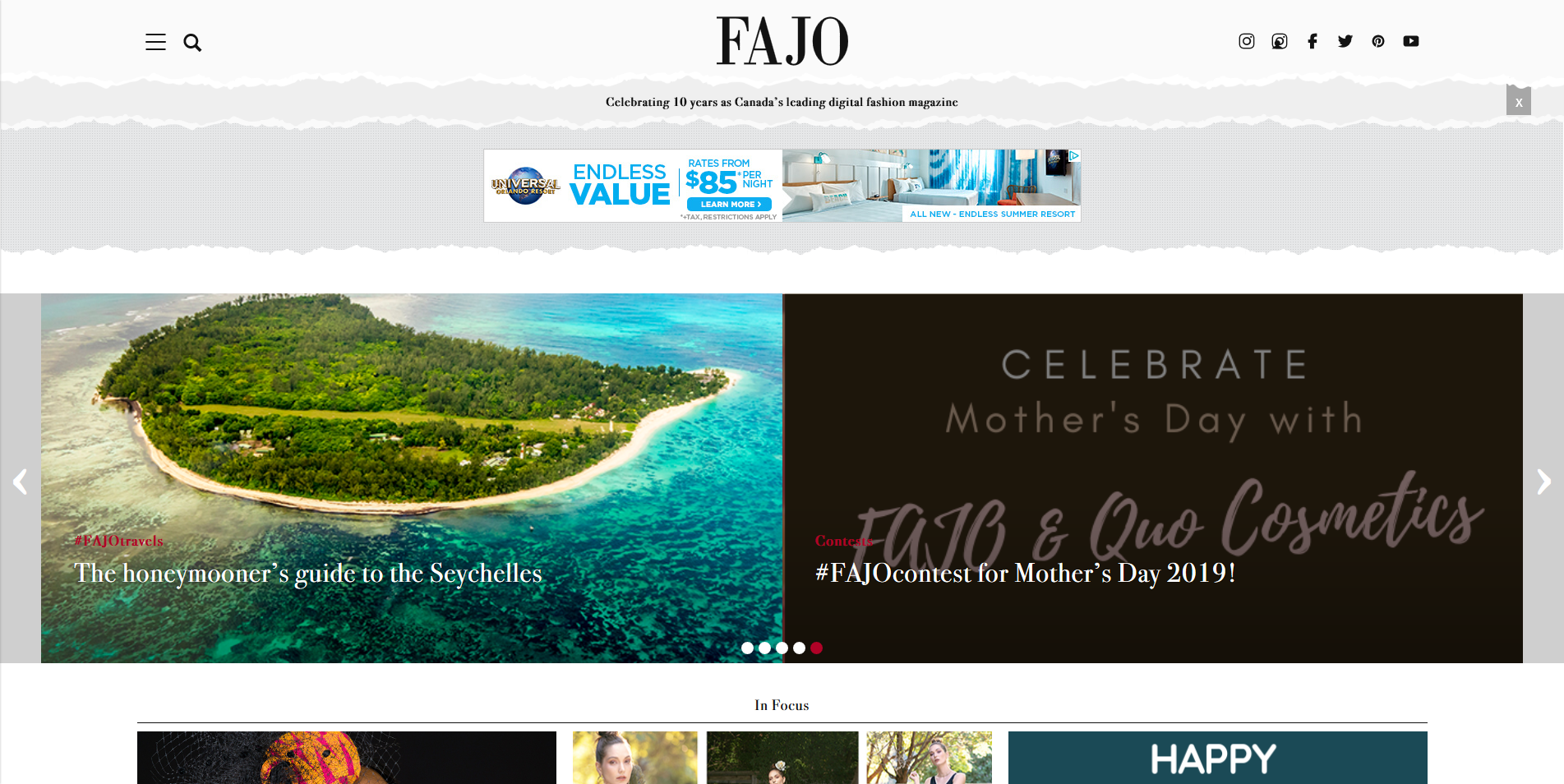
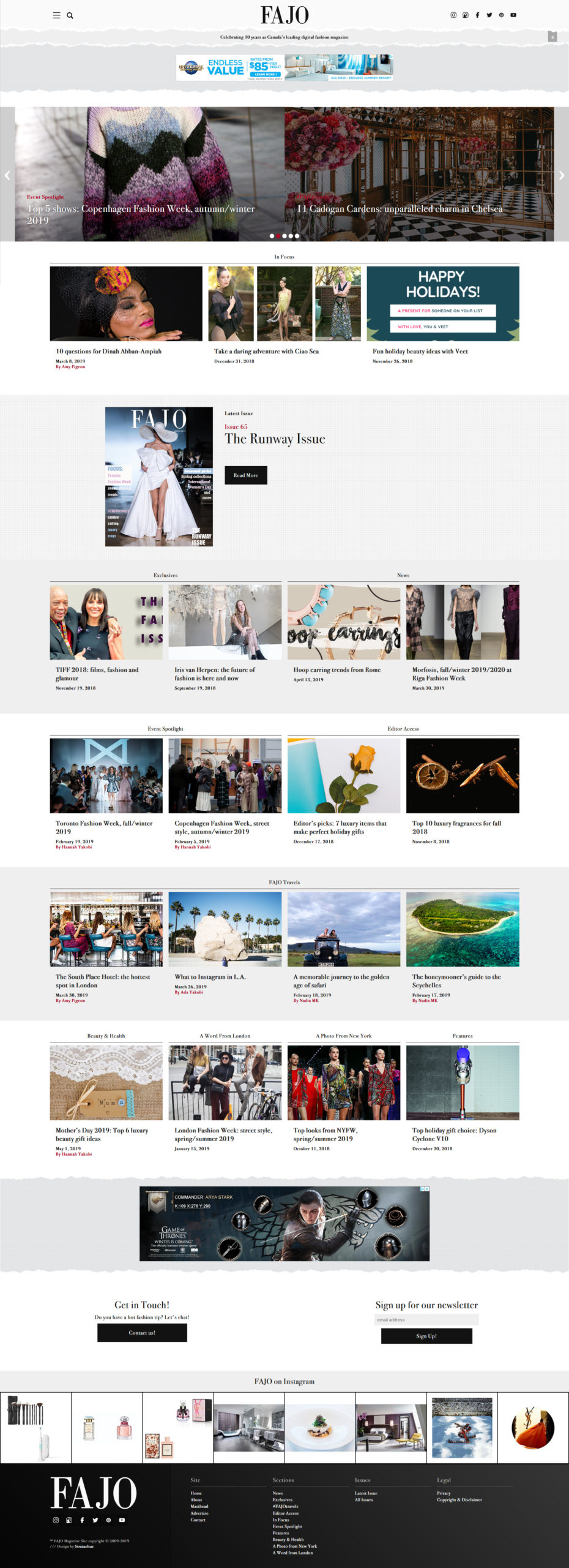
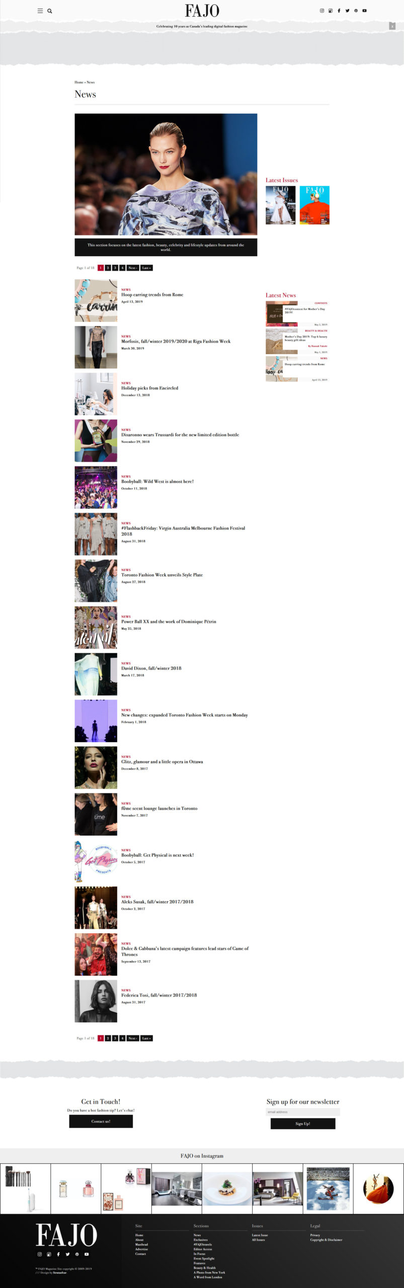
FAJO v.3.1 would end up stripping back most of the ideas of the previous designs in favour of a completely minimalist design: we flipping the colour pallette to use stark white and slightly off-white tones as the dominant visual tones, with the solid black and brand red being used for sharp text and accent elements. All rounded corners on components were abandoned, instead using hard 90° angles for square and rectangular shapes to mimic cosmetic packaging.
We finally implemented a proper “Issues” custom post type, to which all articles could be assigned, and back-archived the entire website to fit into predesignated date ranges for this system to offer a true digital magazine presentation. We additionally removed the rudimentary custom field crediting system in favour of a new authoring system that would allow entries from a “Staff” custom post type to be assigned to an article across a roster of different roles (author, co-author, photographer, photo assistant, art direction, design, hair, makeup, wardrobe, accessories, etc…). This new authoring system would allow us to auto-generate archives for each staff member of all their work at the magazine: much like a one-stop portfolio archive for all their fashion journalism achievements.
