
I was hired as the Art Director of the Toronto daily evening commuter newspaper in late October 2009 – not quite 2 months following their inaugural issue (Sept. 8, 2009). T.o.night had previously been artistically managed by two prior Art Directors before my hiring – both of whom had left the publication for various reasons; however, as I had not been present for the initial development of the paper’s design not only was I tasked with intimately learning how it functioned and the purpose of each subtle nuance, but in working closely with the editor-in-chief and the publisher to determine what wasn’t working and how best to make it better.
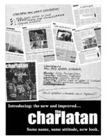
Much as I was tasked with redesigning the weekly student publication The Charlatan during my late days at Carleton University, the t.o.night redesign left me in a situation where I didn’t have complete artistic license – as it was an existing property – though it would allow me to repair the functionality of each individual element and then determine new methods of reintegrating these pieces back into the proverbial journalistic puzzle.
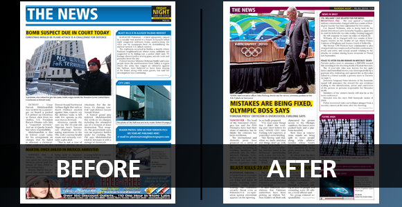
The most evident change – aside from the substitutions of section colours (which was done in order to create a greater distinction between t.o.night and its early-morning competitors Metro and 24) – is most likely the header which was initially designed as a large 1.5″ stack of bars in varying heights – using up much-needed editorial spacing on nothing more than a fairly useless block of colour.
Playing off the file-folder motif which had been initially used much more sparingly in the sidebars, I reworked the header as an alternate folder piece that would seemingly link into the sidebars which would most likely appear on every page anyhow – basing this slightly on the small section tabs that hang from the tops of pages in Macleans.
Lead stories with photos and standalone photos were changed to run directly underneath the header to preserve as much of the images as possible, adding a much greater visual value to the page, while the various body texts – both story and sidebar – were altered in size, justification, and were set to align-to-baseline for much-improved readability. Spacing was unified among all page elements to 9.5pt to create a more clean looking publication (as body text typeface had already been standardized to this height). This spacing change was further emphasized by the placement of 0.5pt 75% black horizontal bars separating lead and secondary stories on pages (should this layout be resultant) – much in the style of the Canadian newspaper The Globe and Mail.
Headlines on standalone photos were altered in placement to rest directly on their photographs to save vital editorial space, while they were also colour-coded by section – this colour-coding was also included on story locations in body text in order to help add an extra visual element on the page that would be easily distinguishable on the daily publication’s signature glossy print stock.
I replaced the crudely-strewn table systems with a legitimate table construction and repaired the angled corner file folder motif with a properly measured and angled one – removing the rounded corners on the bottoms of sidebars and other page elements in order to remove the redundancy of corner effects on the page and improve scalability, as the paper is constructed on a 6-hour production time-line and the rounded corners created discrepancies when their element’s size needed to be adjusted at a moment’s notice.
The ClipArt-style weather graphics were subsequently replaced with illustrator vector images in the simplistic vein of the t.o.night moon logo, and I finally redesigned the Around Town section subway map of Toronto from scratch in order to improve visibility of map elements and ultimately allow for a cleaner view of events taking place.
While this redesign successfully launched with issue 100 (Feb. 9th, 2010), t.o.night maintains that it was not a version 2.0, but merely a v1.1 upgrade – stating that further changes may be introduced in future issues should more successful alternates to page elements, or new page elements for new and different features entirely, be developed.